Why are massive news outlets, such as New York Times and Wall Street Journal, more trustworthy in people’s minds than lets say a lesser known blog?
These gigantic examples have been around for years is one reason, but another reason revolves around the fact that its stories are backed up with credible sources of information.
Nothing supports any case more than cold, hard, unbiased data. In this post, you will learn how to use data visualizations to win over your audience. Let’s get started.
Backing your story or stance up with data is important, but what is even more important is visualizing that data.
According to Stephen Few, a human can distinguish differences in line length, shape orientation, and color (hue) readily without significant processing effort; these are referred to as pre-attentive attributes. For example, it may require significant time and effort (“attentive processing”) to identify the number of times the digit “5” appears in a series of numbers; but if that digit is different in size, orientation, or color, instances of the digit can be noted quickly through pre-attentive processing.
Data visualizations benefit your audience and you in a few ways.
Using data visualizations show that you’ve done your homework on the topic at hand, which leads your audience to believe your content.
Great data visualizations are clean, intriguing and sourced from credible places. This compels your audience to spend more time exploring your data. Amazing static and interactive visualizations invite readers to derive deeper meaning, fostering a more personal, significant and active interaction that enhances all types of content, according to HubSpot.
The best visualizations don’t make your audience work too hard to understand them. Just typing numbers is ineffective. Showing your readers the actual data and explaining what it exactly means will increase their comprehension and will encourage them to spend more time with your data, amplifying its effect.
Data is only powerful if the people you’re trying to reach actually comprehend what it’s trying to show them.
Simply slapping a few charts and bar graphs together does not mean you have a data visualization either. Let’s look at two examples – one good, one bad – of data visualizations and see what makes them so.
Good Example: The Daily Routines of Famous Creative People
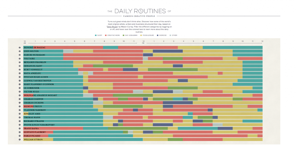
Here’s a prime example of a beautifully designed, interactive data visualization. The data presented is based on Mason Currey’s Daily Rituals, and it displays the daily work routines of famous creatives, filtered by time and activity. This is a fantastic visualization because it encourages the reader to explore and compare the data, which provides deeper insights into the bigger picture or story.
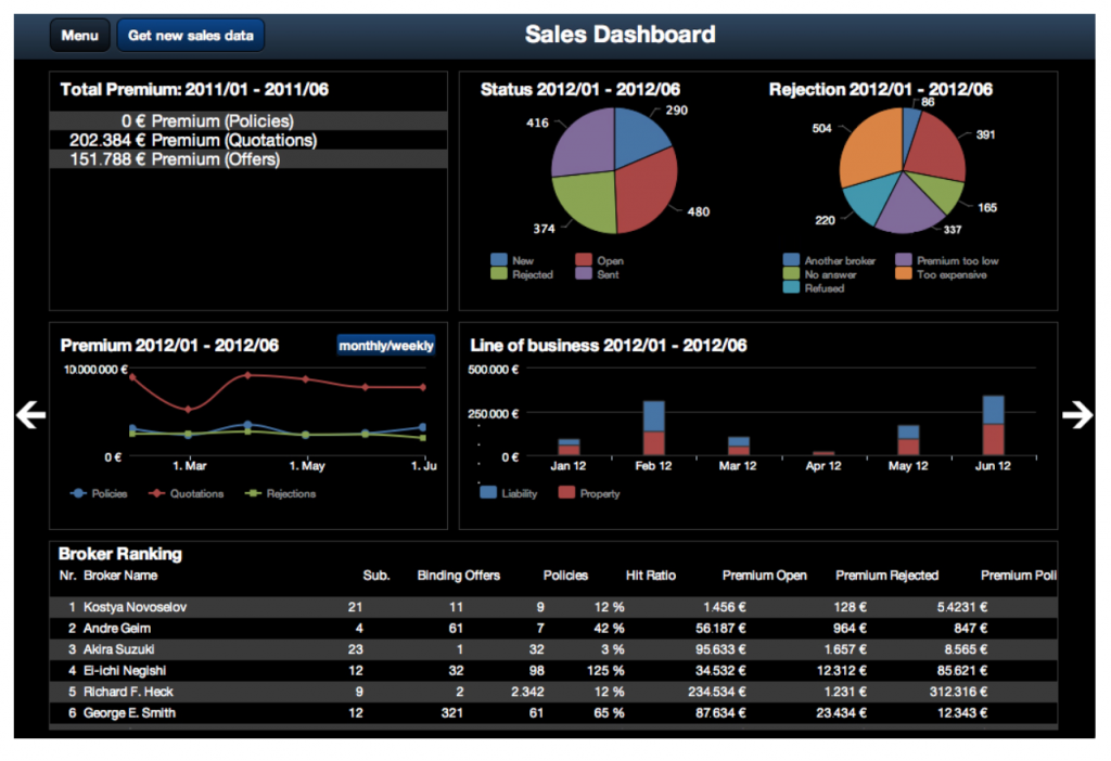
There really isn’t anything good to say about this data visualization, if that’s even what you want to call it.
First off, the visualization’s choice of color is awful. Dark backgrounds encourage readers to stick around for shorter periods of time. Not to mention, if the user wanted to print the graphic, this is a huge waste of ink. Stick with light or white backgrounds.
Second, the dashboard uses poor chart choices. Instead of using a status pie chart, which is divided nearly equally and explains nothing to the reader, the designer should have used an ascending bar chart to make the values more apparent.
Lastly, The Line of Business bar charts are extremely small and difficult to see. Relocating this chart to where the line charts are while making it taller would increase the size of the values, making it more readable to the audience.
Whether you need to clarify a complex topic or fortify your argument, data visualizations are the perfect tools to strengthen your communication at every level of organizations and helps your audience make better (more informed) decisions.
It helps you do a four key things.
There are three specific areas of your organization that will benefit from data visualizations.
Earlier we broke down two examples – one good, one bad – of data visualizations. Hopefully, you recall that good ones present data beautifully and are easily digestible. Poor visualizations are often misinterpreted, which hurts your message and credibility.
Here are six tips for enhancing your data visualizations.
Creatives and analytical types need to work together to design data visualizations that win over audiences. Look for opportunities to enhance the communication flow between these teams, and you’ll find you get much better data visualizations, which compel viewers to your desired course of action.