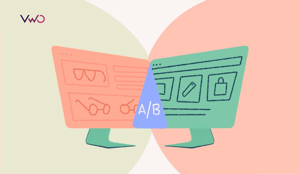
5 Easy A/B Test Ideas To Get You Started on Conversion Rate Optimization
So you’ve just stepped into the world of Conversion Rate Optimization. Everyone seems to be advocating A/B testing. But you are still a little disoriented and would appreciate some direction to get started.
You are in the right place.
The Internet is littered with posts that ask you to go ahead and test this CTA or that headline. It’s essential to remember that the best-performing A/B tests are planned and executed well — using the scientific method.
Download Free: A/B Testing Guide
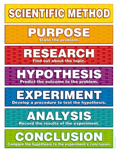
A/B testing comes at the experiment stage of the scientific method. Without such a process, testing becomes a spray-and-pray tactic that yields little dividend.
Without further ado, here are five easy A/B test ideas to give you direction and a glimpse of the many possibilities.
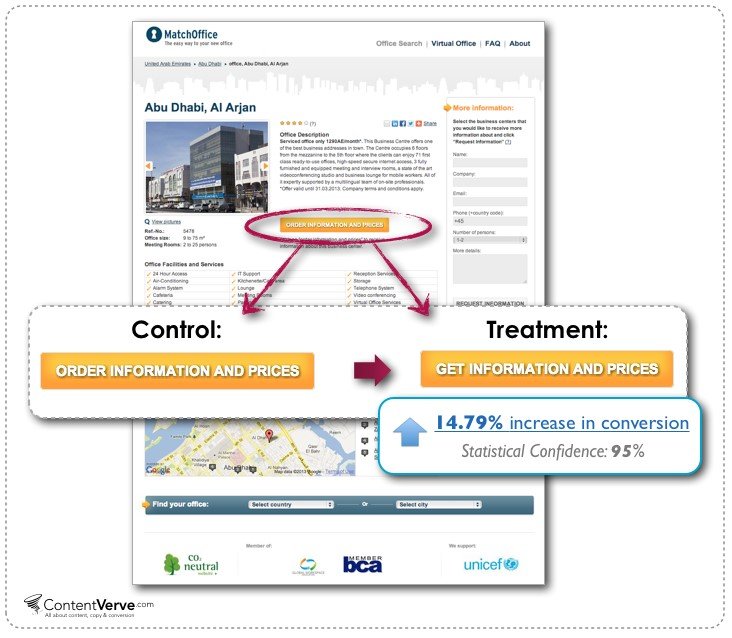
Test 1: A/B test headline copy
Let’s start with headline copy testing, which should be your launching pad in the A/B testing realm, as headlines are a doorway, a welcome mat, that all visitors must cross.
Only 2 out of 10 readers ever make it past the headline, on average. This means that 80% of readers never make it past the headline. If you suffer from lack of conversions on your homepage, it should be an indicator to test your headline. As the first message displayed to visitors, the headline holds the greatest (and easiest) opportunity to optimize your landing pages. The saying “you only have one chance to make a first impression” looms large over grabbing that first-time visitor, and you only have a few milliseconds, according to Carleton University, Canada, before the visitor moves on or bails.
For instance, a company called Monthly 1K wanted to increase the number of visitors purchasing their online courses. They decided to test if they change the presentation of the headline; it would lead to better conversions. The original headline they presented was “How to Make a $1000 a Month Business”. The second headline excluded the dollar sign. The results were crystal clear, providing an actual dollar amount resulted in a higher conversion rate. Visitors were able to visualize themselves making a dollar amount rather than just the number value. Showcase the value of your products; that’s the only thing visitors will ever pay for.

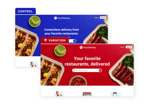
Test 2: A/B test your colors
The color of your words, calls to action, and the purchase buttons are examples of how simple changes (single or multiple) can hugely affect conversion rates. Say you have a scenario where your call to action prompts visitors to click on a “make an appointment” form. You test your calls to action with a red button in the control version and a green button in the variation. You discover that more visitors were clicking through to the appointment form with the green CTA. By changing your CTA to green, your appointment bookings surge. Changing your CTA to a different color won’t work in every situation, but since you’re testing it with your live visitors, you can see firsthand what makes them click.
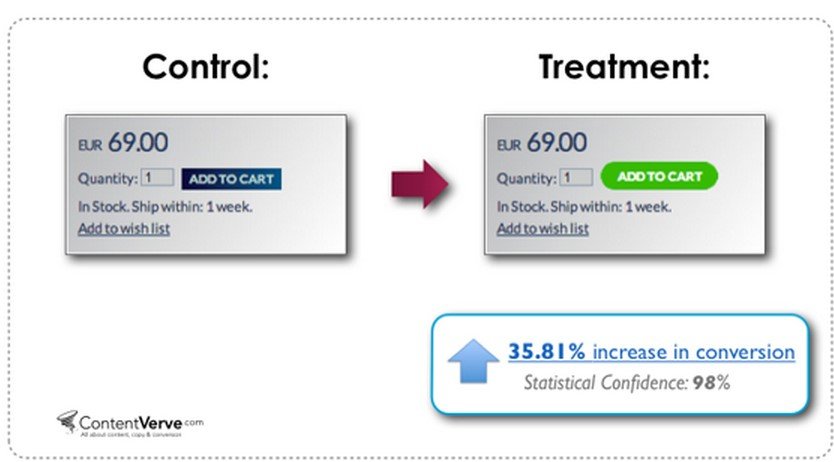
Take a look at the case study below on how a color change can positively affect conversion rate. Here the color change was done in conjunction with a button design change. The combination of the two led to a nice conversion increase. This particular online seller realized a gain of over 35% in cart additions.
Test 3: A/B test call to action
This is where all the magic happens. You’ve gotten visitors to your CTA. You want them to click, and your team has come up with 12 different CTA buttons with different combinations of wording, colors, and fonts.
Sometimes, all those things do not play much of a role. Often, it’s just the wording on a call to action, not a time-consuming redesign or color change. A key takeaway from the example below is offering the user value. You are offering them something in return for a click on the button.
Your landing pages should inspire users to take action, whether signing up for your blog, booking an appointment, downloading content, or buying a product. There are several sub-elements you should take into consideration when testing variations of your CTA.
- Switch the wording on your CTA button to one that you feel would grab your target. Just one phrase often does the trick and translates to higher conversion. Buy, Click to Purchase, Checkout are just a few.
- Test a page with a few CTAs against a variation with a single button.
- Consider switching the location of the CTA on your landing page.
Zwitserleven achieved a 14.41% hike in click-throughs to the sign-up page by A/B testing the copy on their CTA button.
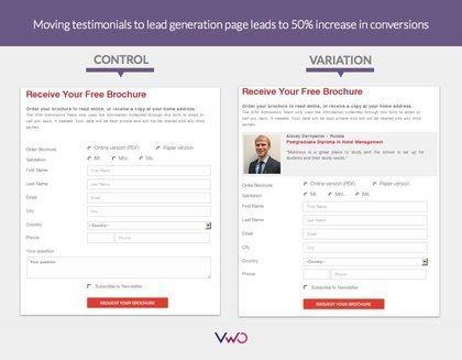
Test 4: A/B test the form
Your website might be a five pager, or it could be 20 plus. The more entry points your website has, the more chance for friction with the visitor. Forms are just such examples of potential friction. Anytime you request visitor information, know that the lesser information you request, the better your chances of procuring the information. How you ask it can also make a huge difference. That’s where form analytics enter the conversion rate optimization game.
There are plenty of variables to try out. Here are some format ideas to get you started:
- Test forms with images/video on them versus none.
- Test 5 field forms against three field forms
- Test a form that includes a special offer or discount to one that does not
- Test a form with an assurance that the signer will not receive spam or other messages unless they opt-in
- Test a form with larger fields rather than letter-sized fields
Hotel Institute Montreux achieved a 50% jump in the form submission by moving a testimonial atop the submission form in the variation and testing it through split URL testing.
Download Free: A/B Testing Guide
Test 5: Social widgets A/B testing
While social proof is a big part of increasing user confidence, it can also have a negative effect. Let’s take a look at why:
- Social sharing buttons are a distraction as they take away from the true call to action
- Many times, the social numbers are so minute that it diminishes social proof
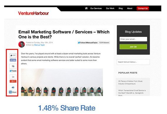
Also, did you know that the addition of social sharing buttons can even lead to decreased conversions? There are a number of reasons for this. To highlight this fact, I suggest reading this great case study on how Taloon.com increased their conversions by 12% by removing social sharing buttons.
However, each case differs, and sometimes social widgets will increase the conversions on your page. Marcus Taylor of Venture Harbour found that a floating sidebar outperforms share buttons located above or below a blog post. He ran an experiment on a blog post and found that using a floating sidebar with sharing buttons increased the rate of sharing by 52%. The moral of the story is not to follow random suggestions on the best placement for your social sharing buttons. By adding and removing the widgets and testing those versions, you’ll always be able to decide the better option.
Testing all these elements to determine which one converts better on your landing page is a learning experience. Tracking email click-through rates may prove to show you which headlines work better. Twitter is also a great way to gauge headline effectiveness.
Go ahead and do your first A/B test. Conduct tests with your users in mind and with an efficient CRO roadmap targeting your ultimate business goals.
Watch the latest episode of the VWO Podcast to learn how top brands test more ideas rapidly.
Categories: