


I decided to write this post after I started teaching my daughter to write last week.
Since I have no idea on how to teach someone to write, I just drew her name using lines dots and told her to draw a line between them and connect them.
This is how it looked at first:
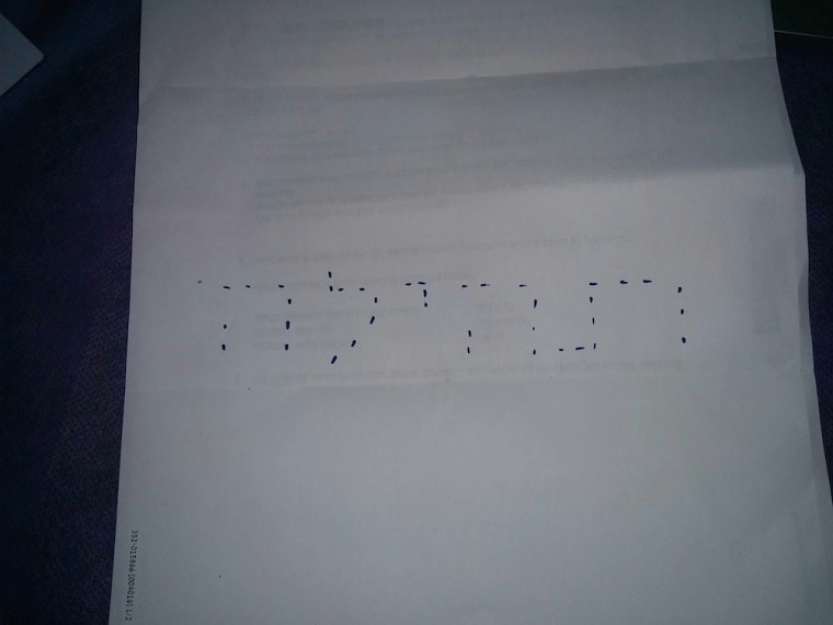
While she was drawing the line I looked at her and noticed something really odd – she connected the straight lines without a problem, but the edges of the letters, she just skipped!
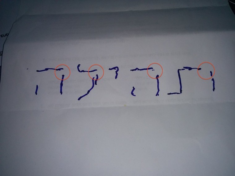
This is how it looked at the end (notice the edges I marked in red):
The first explanation that came into my head was the Gestalt Principles of course, and in this post I will show you why those rules are very relevant to internet marketing and how they can help better optimize your site.
Introducing Gestalt
The definition of Gestalt in one sentence is:
“Gestalt psychology tries to understand the laws of our ability to acquire and maintain meaningful perceptions in an apparently chaotic world.”. (Wikipedia, Gestalt psychology)
According to the Gestalt, every event in our lives goes into a fixed pattern that was created from previous experiences and events throughout our lives, and it is according to this pattern that we interpret the event.
This approach obviously has many aspects, but I will only be examining the visual aspect, meaning the way in which we translate what we see, and as a result – how we act in accordance to what we’ve seen. (Or more accurately, the interpretation we give what we saw)
In the following parts of the post I’ll present you with the different principles of the method, and show you how you can apply each of those principles in the optimization of your website.
If you can understand how your users interpret what you show them on the site – you’ll be able to unconsciously effect their actions and make them do what you want them to do – to convert more.
First Principle: Law of Proximity
The law of proximity says that a group of objects will always be associated to the group of objects that’s near them, and not to the one that’s further away.
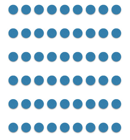
In the following image you’ll notice how your brain interprets it as “an image of circles sorted in horizontal lines”, even though theoretically there’s no reason to not see them as vertical lines:
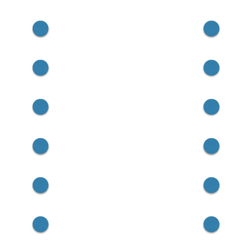
In the next image however, the situation turns around because the vertical distance is greater than the horizontal distance, which is what makes our brain interpret the image as “two vertical columns of circles”:
And what does that have to do with improving website conversion rate? It’s very simple.
Notice the registration form on Zappos below. You can see that both email fields are much closer to each other than the name or password fields. Zappos didn’t do that by mistake, but because it improves the user’s sense of orientation within the form, improves his experience on the site and as a result improves the rate of registrations.
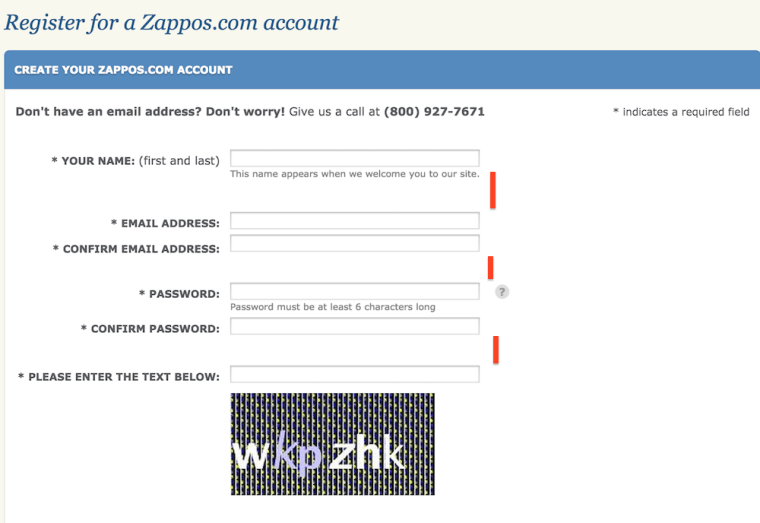
This method of organizing helps the user feel in control, and that good feeling of course helps him complete the task we’re asking him to – register.
If we go back to the example I presented at the beginning of the post – my daughter didn’t connect the edges of the letters, simply because the dots at the edges were greater apart from one another than the ones in a straight line, so it seemed more trivial to her to connect the vertical and horizontal dots separately:
Second Principle: Law of Closure
The second principle says that our brain tends to associate what it sees to things it already knows, and if need be, complete the missing information without it being asked.
For instance, look at this image:
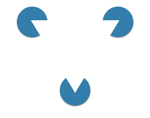
Do you see 3 packmen or the triangle in the middle?
It’s safe to assume that you saw the triangle, and that’s exactly the law of closure – our brain tries to interpret the image and it quickly finds out that if it draws a line between the “packmen’s mouths” it will create the shape of a triangle, which it obviously knows well and can quickly recognize.
For the law of closure to take place we must provide our brain with enough information so that it can fill in the gaps, but not too much information because then there will be no need for it to complete the image.
That principle can be seen in many logos of different companies today. Here are a couple of examples:


Third Principle: Law of Good Figure
This principle, also known as the law of simplicity says something very simple – our brain would rather look at things in a simple manner so that it’ll be easy for it to associate them with things it already knows.
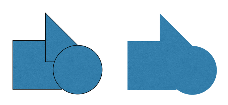
It’s safe to assume that your brain preferred to interpret the right image as “a square, a circle and a triangle” instead of as a complicated image. (See? I don’t even have the words to describe it), and in order for it to be more convenient it even drew an imaginary line to create those shapes.
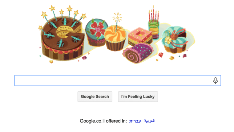
This principle also helps us recognize Google’s creative doodles, which often don’t even resemble the word Google but our brain thinks that it does.
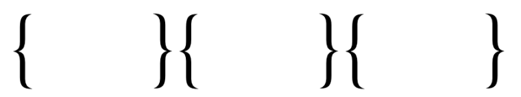
Forth Principle: Law of Symmetry
The law of symmetry says that our brain would rather look at things symmetrically.
According to the law of closure you should have looked at the inner brackets as a single unit, but I suppose your brain interpreted the image as 3 pairs of brackets.
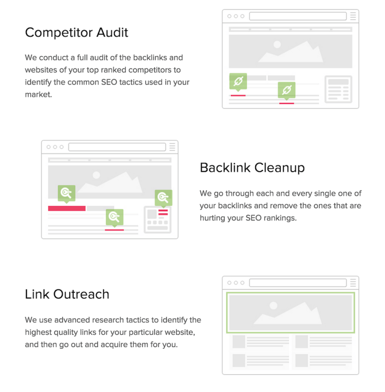
Today, there are many sites that present their features in a form of an image with a text by its side (see this features page for example), and our brain would rather look at different elements horizontally (line above line above line) rather than vertically (columns) because its more symmetric. Precisely for that reason – it would make more sense for us to connect the picture to the text beside it instead of above it/beneath it:
Fifth Principle: Figure/Ground Law
This principle might be one of the most significant ones in your optimization efforts, and often we apply it without even noticing.
Over all, what this law says is that when we see elements with strong contradictory colors that are near each other or above each other, our brain will attempt to understand which of them is more important (which you should be focusing on) and which has the role of background/scenery.
Our brain’s ability to tell the difference between the important and the unimportant depends mostly on the level of ease in which it can do so, therefore the higher the contrast is between the figure and the ground will be, the easier it will be for our brain to see them apart and tell the important from the unimportant.
In front of you is the most common example of this principle. In the next image, do you see a chalice or two faces staring at each other?

Since the contrast between them isn’t high enough, our brain has a very hard time deciding which is the figure and which is the ground.
Applying this principle in your optimization efforts is primarily reflected in the background of the CTA buttons on your website/landing page.
Notice GrooveHQ’s website for instance, who chose a white background without any graphics in order to emphasize the call to actions buttons in the best way:

Another, more obvious example can be seen on eBay, who present a photo of a product and on it there’s the CTA button with white background:

Without the white background, the CTA button would have blended in with the picture in the background, thus making it more difficult for the user to understand that he’s supposed to click on it.
Another example – KISSmetrics’ homepage, where they added a black background to the picture in order to emphasize the text, thus making users focus on it and on the CTA buttons rather than on the background image.

Sixth Principle: Law of Uniform Connectedness
This principles says that “elements that are connected by uniform visual properties are perceived as being more related than elements that are not connected”.
Notice the following drawing for example – even though the squares are closer to each other (and look-alike) than the circles, our brain connects each square with a circle because they are joined together by a line:
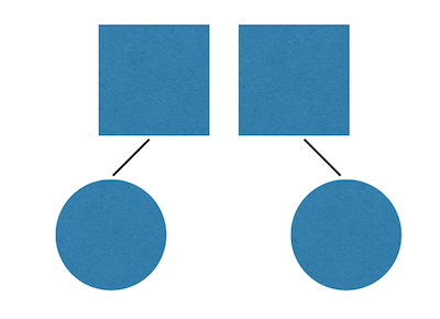
Notice that even though the lines aren’t fully connected to the shapes, they still make our brain ignore the rest of the rules (proximity and simplicity) and interpret the square-circle as a single entity.
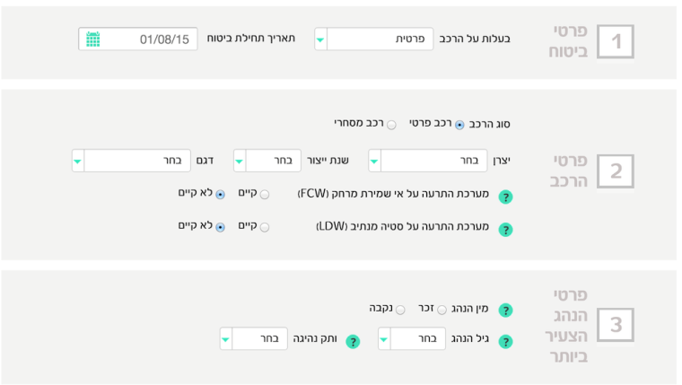
This principle is very common and you can see it mostly in forms where a number of fields with common background are grouped up. In the next image that taken from this Israeli insurance site, you can see that the gray background is actually the drawing that connects these fields and makes them appear related to one another, without depending on the distance between them/their simplicity.
Another example can be seen in Unbounce’s site, who have connected the three circles with each other to transmit the feel of a single process:

Seventh Principle: Law of Similarity
This principle says the objects with common ground will be perceived as belonging to each other more than objects with less of a common ground.
That common ground can be shape, color, size, texture, and more.
When a user sees that a number of objects have similar characteristics, it tends to associate them with one another and treat them equally.
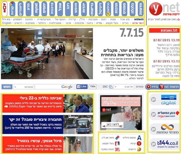
Take Ynet’s homepage for example, which suffers from a severe visual load and yet is able to help us clearly distinguish which object belongs to what, thanks to the difference in shape between objects.
The upper menu is organized in the same shape, the links beneath it are organized differently and so are the rest of the objects on the site.
All organized in a way that helps us notice exactly what belongs to what.
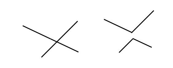
Eighth Principle: Law of Continuity
This principle says that our eye searches for shapes that flow without sudden changes, which is why we would prefer to look at the left image as two lines that cross each other instead of as the right side image – two lines that suddenly break:
You can find this law applied in the following site that links between the biography and the photo in a slightly unusual way, and yet clear enough for our brain to understand what belongs to what:
Conclusion
Improving conversion rate is a subject that includes a lot of psychology, and the Gestalt principles can help you greatly in that process.
There is obviously so much more to Gestalt than what I presented in this article, but I decided to showcase the most noticeable and common laws, so that you can use them to improve conversion rate on your landing page or website.
Image Credits
Featured image: ra2studio/Shutterstock.com
In-post photo #1: Image by Shuki Mann
In-post photo #2: Image by Shuki Mann
In-post photo #5: 360b/Shutterstock.com
In-post photo #6: nattul/Shutterstock.com
In-post photo #9: Frank Fiedler/Shutterstock.com
All screenshots & Illustrations by Shuki Mann. Taken July 2015.
