- The Straight Port
- Designing for One Form Factor
- Small Touch Targets
- Neglecting Touch Feedback
- Exhaustive Forms
- Neglecting the Swipe View (Horizontal Paging) Pattern
- Deep, List-based Navigation (Drill-down List Navigation)
- Pogosticking
- Conclusion
- Frequently Asked Questions (FAQs) about Android Design Anti-Patterns and Pitfalls

The more apps behave the way we expect them to, the more intuitive they are to use; the more intuitive they are to use, the easier it is for us to concentrate on our true objective.
The best user interfaces are so intuitive that the UI just disappears and lets us concentrate on what truly matters. People tend to be unaware of the user experience in an app unless it doesn’t meet their expectations.
According to Wikipedia, an anti-pattern (or antipattern) is a common response to a recurring problem that is usually ineffective and risks being highly counterproductive. In this article we’ll look at some anti-patterns and bad practices common in some Android applications, that get in the way of the user accomplishing their tasks, thus providing a poor user experience.
The Straight Port
The Straight Port is an app that was first made for another platform (usually iOS) and was later quickly and minimally made to work for Android. This usually results in Android apps that have the visual styling and UI conventions of other platforms.
The “design once, ship anywhere” approach rarely works. Different platforms have different rules and guidelines regarding UI and usability and you have to take this into consideration when designing for a particular platform. Your users expectation and behavior has been shaped and influenced by using other apps on that platform.
If your app doesn’t meet these, it’s bound to cause frustration. Android users expect Android apps, so it’s worth looking through the Android design documents to be conversant with the platform’s conventions.
A few common pitfalls of the straight port are:
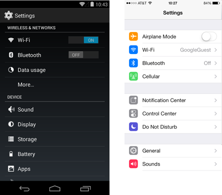
1. Bottom Tab Bars
On Android, tabs belong at the top.
 (Source:http://www.google.com/design/articles/design-from-ios-to-android/)
2. Using iconography from other platforms
3. Right pointing carets on list items
 (Source: http://developer.android.com/design/patterns/pure-android.html)
For more on this, you can read this guideline on how to design for Pure Android. There is also this article on designing from iOS to Android that is more recent as it covers designing for Android in the era of Material Design.
Designing for One Form Factor
Unlike other platforms where you can determine the device your app will run on – either phone or tablet and know the screen sizes, on Android, this isn’t possible. You must therefore design your app to be adaptive so that it works well on phones as well as tablets. The screen sizes of these devices also vary so you must take this into account. A well designed Android app works well and looks good on any device and screen size.
Other than designing for phones and tablets, you should also ensure that your design doesn’t break when the user changes the device orientation. You should design for both portrait and landscape modes.
Don’t assume that the user will only use the app in portrait, and neglect landscape orientation. When the developer doesn’t provide specification for landscape orientation, the Android system tries to lay out the UI as well as it can with what it has. This usually results in the same UI seen in portrait mode spread out to fill the larger landscape orientation. Elements are usually stretched out and greatly spaced out on the screen.
Small Touch Targets

Small touch targets can slow down a user as they increase the chances the user has of making a wrong selection if the target is next to other targets. The app may also seem to be non-responsive as a user taps on what they think is the area affected by the touch and see no noticeable action take place.
On Android, the ideal size of touch targets is at least 48dps. The material design specifications document provides guidelines for keylines and metrics you can use when designing your apps.
Neglecting Touch Feedback
Selections need to be immediately obvious. Touchable elements should have a pressed and focused state. Not giving a user feedback when they take an action increases the app’s perceived latency – the app seems slower.
Selected items are made obvious by use of color and shape (e.g. making an icon/font bold). In material design, shadows are used to show that an element is at the forefront.
Material design has emphasized the use of touch feedback by not only making use of shadow, color and shape, but by also strongly encouraging the use of animations and transitions to give the user feedback. The following are some points from from the Material Design Guide.
- From the point of input (the contact point of a finger or the microphone icon for voice), make the visual reaction radial. This is seen as ripples that originate from the point of contact.
- When a user triggers the creation of new material, it should grow in size starting from the point of input. Material appears from the touch points tying the element to the point of touch.
- Assign elevation to your views. Use animation when elevating elements.
- When a card or separable element is activated, the card should lift to indicate an active state.
Exhaustive Forms

Phones and tablets are usually not the best devices to input a large amount of text. You should try to cut down the number of fields a user has to fill.
If the form is a registration form and you do need all that information from the user, then you could only ask for a few details on the mobile signup form with the option of completing the process once logged in to the web application.
Remove repetitive or non-essential fields like the password confirmation field, and it’s also best to not put too many constraints for acceptable user input like passwords which must be X characters long, include one uppercase letter, one special character, alphanumeric characters, and so on. You should also provide the user with the right keyboard for the particular field in focus e.g. number pads for fields requiring digits only, email keyboard for email fields, e.t.c.
Whenever you can, provide reasonable defaults to input fields. For instance, for email fields, you could suggest email addresses known to the device. For login and registration, you might forego forms altogether by using common providers like FaceBook, Google+ and Twitter (but still include an email alternative). You should strive to make the form filling process as painless as possible.
Neglecting the Swipe View (Horizontal Paging) Pattern
Horizontal Paging allows the user to efficiently move from item to item using a simple swipe gesture and thereby make browsing and consuming data a more fluent experience. Horizontal paging is commonly used on tabs and on detail pages.
On a phone, since the master and detail pages are on separate screens, navigating these views typically requires the user to jump back and forth between the list and the detail view, aka pogosticking.
In cases where users will want to view multiple detail items in succession, avoid ‘pogosticking’ by using the swipe gesture to navigate to the next/previous detail view. This can be seen on the Android Gmail app, where once you open an email, you can navigate consecutive email messages using the swipe gesture.
If your app uses action bar tabs, enable swipe to navigate between the different views. This is something that is commonly neglected in some apps, resulting in tabs that can’t be swiped through. The user shouldn’t have to tap on a specific tab item to navigate to that view.
Whenever the Navigation Drawer is used, swiping from left to right should bring it up. The user shouldn’t have to tap on the hamburger icon to access the drawer.
Horizontal paging makes navigation faster, but there are cases in which they shouldn’t be used, for instance when the view contains horizontal panning surfaces (such as maps), including horizontal paging on such a view may deter your screen’s usability due to the conflicting interactions.
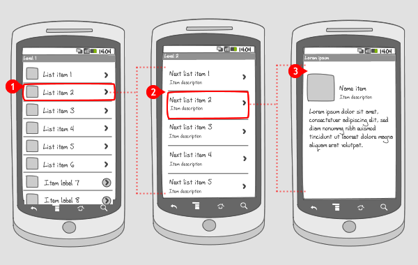
Deep, List-based Navigation (Drill-down List Navigation)
A deep list-based navigation, known as drill-down navigation, is where lists lead to more lists which lead to even more lists. It is often inefficient and cumbersome to use. The number of touches required to access a piece of content with this kind of navigation is generally very high, leading to a poor user experience – especially for users on-the-go.
This type of navigation is often tedious to use as making the wrong selection means, going back to the right list, re-orienting yourself and making another choice. This can quickly become frustrating.
A deep list-based navigation is usually a result of trying to give users too many choices and/or putting too many features in your application. Both of which make for bad user experience.
The book ‘The Paradox of Choice‘ speaks of the negative effect of giving people a lot of choices. Having a lot of choices is usually intimidating and it slows down the decision making process. Picking from a small number of choices is faster and easier than picking from a large number of choices.
Putting too many features in your app is usually done in trying to build a great app for everybody, which usually results in building a great app for nobody. Remember the 80/20 rule – 80% of users will only use 20% of the features of the app or stated differently: 80% of the time, people will only use 20 percent of the capability of the app.
If you show people functions that they don’t need or information that they don’t care about, that will just be a distraction and will get in the way of them accomplishing their task. People also tend to skim through long lists or lengthy information which usually causes them to skip some items. What they skip could very well be what they were looking for in the app. So they may conclude that the app doesn’t offer what they need and uninstall it to look for something better.
Pogosticking
Gallery pages (list and grid views) are a common way of presenting information to users in apps. Most of the navigation decisions are made on these pages. Drilling down to the detail page should be necessary only to actually engage with the item.

Poorly designed list and grid views do not provide enough information to make a good navigation decision, so the user must jump in and out of the multiple detail pages like a person on a pogostick. Thus the term pogosticking which was coined by UX designer Jared Spool to explain this.
List and grid items should show enough information on them so that the user knows what to expect from the item’s detail page.
Using the Action Bar Overflow for Core App Navigation
On Android, primary app navigation is done using Navigation Drawers, Tabs or Spinners. The Action Bar overflow is used for action related items e.g. Search and Settings. You should also look out for the reverse of this: don’t put items not related to the core navigation in places such as the Navigation Drawer.
A common maxim for this is Navigation on the left, Actions on the right.
Conclusion
The above is not an exhaustive list of what to look out for when designing for Android, but hopefully it helps you in your design decisions and shades some light on any anti-pattern you might be implementing in your app. The best place to start in learning more about Android design is of course, the official documentation. There is also this great resource that shows the iOS and Android versions of popular apps.
It’s a great place to not only find design inspiration, but to learn about platform conventions.
Frequently Asked Questions (FAQs) about Android Design Anti-Patterns and Pitfalls
What are some common Android design anti-patterns and pitfalls?
Android design anti-patterns are practices that may seem correct but can lead to inefficient or problematic outcomes. Some common anti-patterns include overusing fragments, neglecting the back button’s functionality, and ignoring the Android design guidelines. Pitfalls, on the other hand, are potential problems or difficulties that are not immediately obvious. These could include not considering different screen sizes and resolutions, ignoring the importance of touch feedback, and not optimizing for different Android versions.
How can I avoid overusing fragments in Android design?
Overusing fragments is a common anti-pattern in Android design. To avoid this, it’s important to understand when to use fragments and when to use activities. Fragments should be used for modular sections of an activity, while activities should be used for different screens within the app. Also, consider using the single activity architecture, where you use one activity as a container for all your fragments.
Why is the back button’s functionality important in Android design?
The back button’s functionality is crucial in Android design because it provides a familiar navigation pattern for users. Ignoring its functionality can lead to confusing navigation and a poor user experience. Ensure that the back button behaves as expected, taking the user back to the previous screen or closing the current activity.
How can I optimize my app for different Android versions?
To optimize your app for different Android versions, use the Android version market share data to prioritize which versions to support. Also, use the Android compatibility library to ensure your app works on older versions. Test your app on different Android versions to ensure it works as expected.
What are some best practices for designing for different screen sizes and resolutions?
When designing for different screen sizes and resolutions, use density-independent pixels (dp) instead of pixels (px) to ensure consistent sizing across different screens. Also, use responsive layouts that can adapt to different screen sizes. Test your design on different screen sizes and resolutions to ensure it looks good on all devices.
Why is touch feedback important in Android design?
Touch feedback is important in Android design because it gives users confirmation that their action has been recognized. Without touch feedback, users may be unsure whether their action was successful, leading to a poor user experience. Use visual cues such as color changes, animations, or vibrations to provide touch feedback.
How can I follow the Android design guidelines?
The Android design guidelines provide a comprehensive guide on how to design your Android app. They cover everything from typography and color to navigation and interaction patterns. To follow these guidelines, familiarize yourself with them and refer to them throughout the design process. Also, use the Material Design components provided by Android, which follow these guidelines.
What are some common Android design patterns?
Android design patterns are solutions to common design problems. Some common patterns include the Model-View-Controller (MVC), Model-View-Presenter (MVP), and Model-View-ViewModel (MVVM) patterns. These patterns help to separate concerns in your app, making it easier to maintain and test.
How can I learn more about Android design patterns and architecture?
There are many resources available to learn about Android design patterns and architecture. The official Android Developer website provides comprehensive guides on these topics. Also, there are many online tutorials, courses, and books available. Practice implementing these patterns in your own projects to gain a deeper understanding of them.
What are some resources for staying updated on Android design trends?
Staying updated on Android design trends is important for creating modern and user-friendly apps. Some resources for this include the official Android Developer website, design blogs, and online communities such as Reddit and Stack Overflow. Also, attending Android developer conferences or meetups can provide insights into the latest trends.
 Joyce Echessa
I am a web developer who dabbles in mobile development from time to time. You can find me on Twitter @joyceechessa to see what I’m up to.