PORTLAND BY THE NUMBERS
11 Infographics that Explain Portland Better than Portlandia
Maps, charts, and graphs that reveal our city's past, present, and future.
This chart—based on a concept executed on a global scale by designer Jack Hagley, with sources ranging from the Census to Multnomah County election results—envisions Portland as a community of 100 people. The resulting breakdowns sometimes use aggressive rounding to land evenly on 100, but provide glimpses of our evolving demographics, lifestyles, languages, identities, and politics. Click on the image to zoom in to the data.
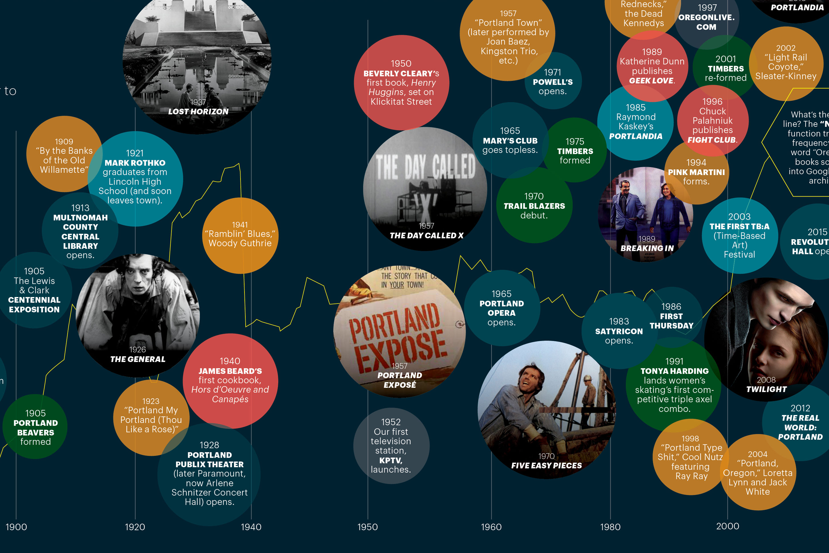
Dive into the cultural timeline above with a Spotify playlist featuring the top songs about Portland.

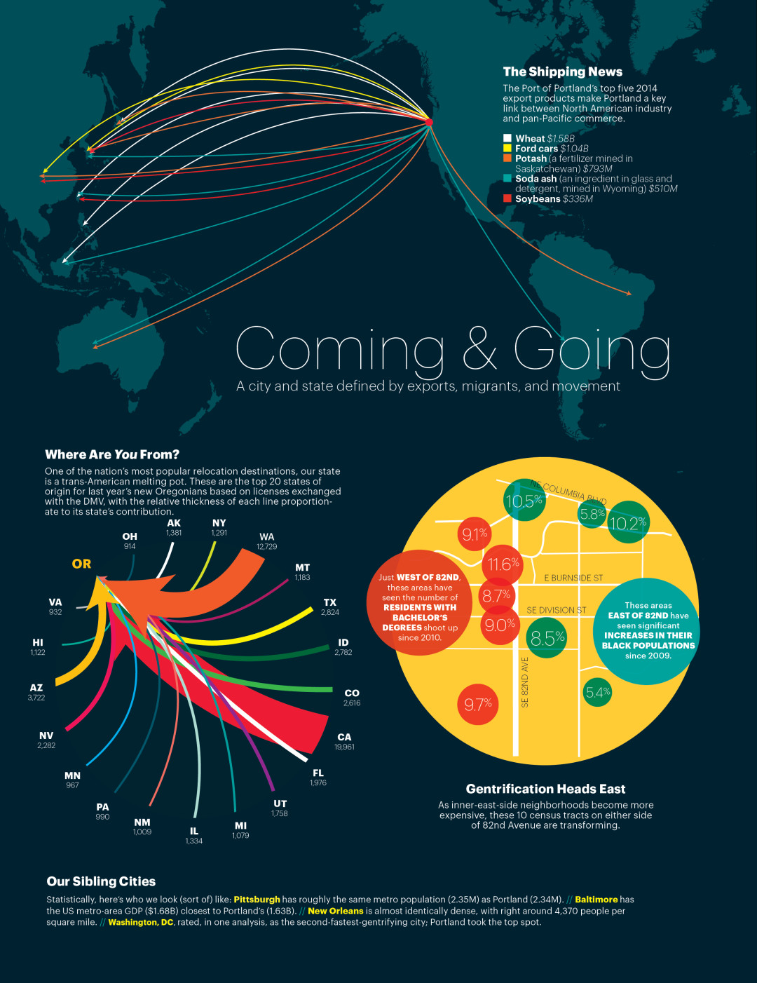
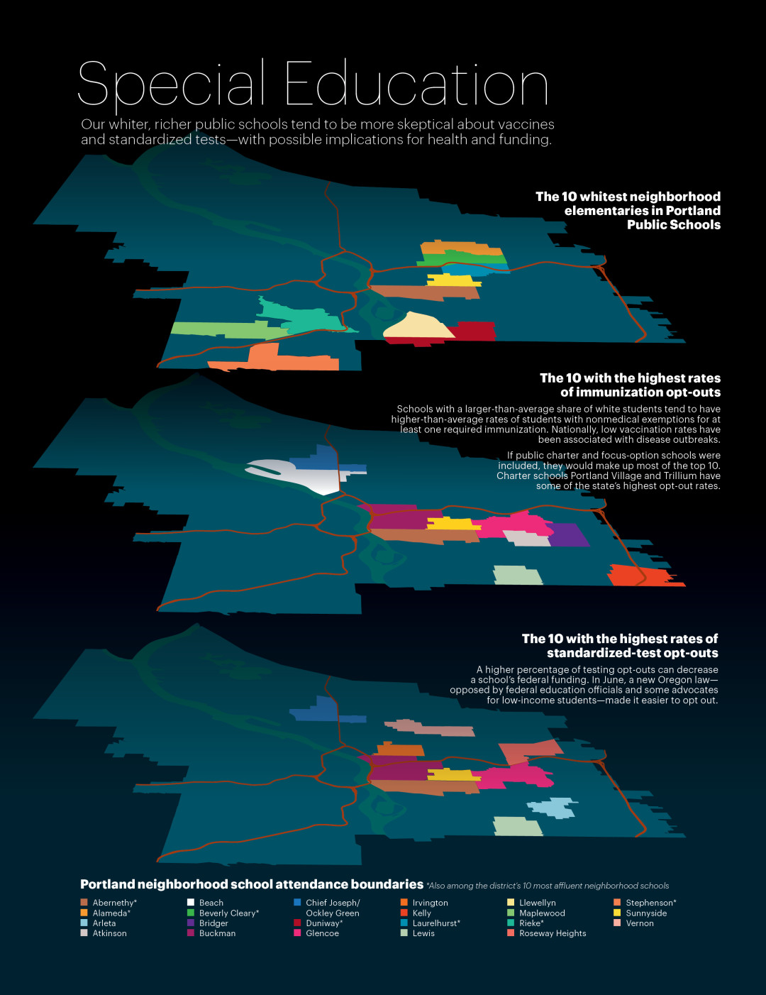
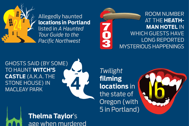
PDX INDEX
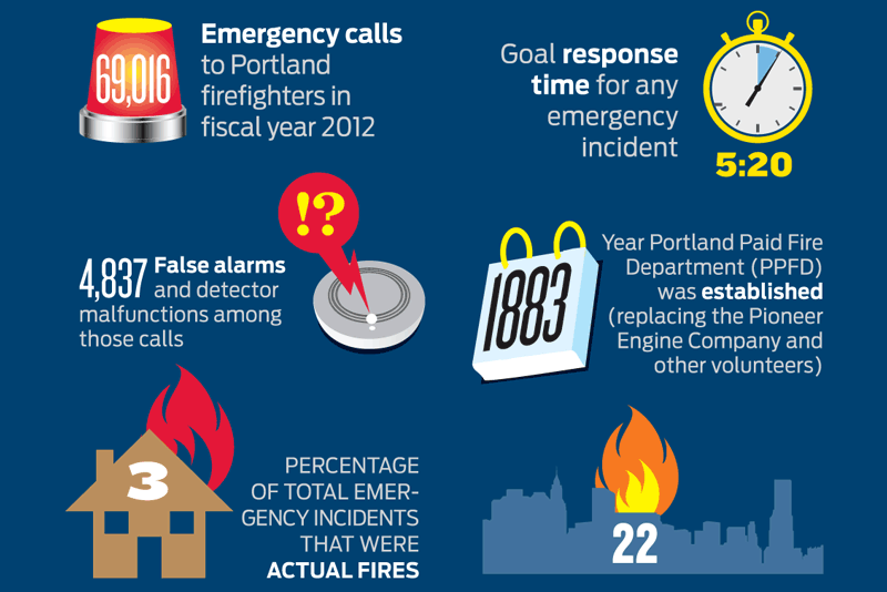
PDX Index: Fire in the City

OREGON BEER GUIDE
Mapping Beervana’s History [Infographic]
PDX INDEX