
Navigating the web is a means to an end and every click counts. Users need to know which areas of the page are plain static content, and which areas are clickable (or tappable).
Make clickable elements obvious to users so they don’t need to ponder the meaning of design elements or encounter nasty surprises when something doesn’t work as expected. As Jakob Nielsen puts it, “Life is too short to click on things you don’t understand.”
It’s a simple matter of interaction cost: People treat clicks like currency and they don’t spend it frivolously. They guard clicks with care and resent sites that force them to hunt for clickable items, or, even worse, waste their clicks.

A major factor in attracting clicks is the quality of the link text. However, this article focuses on the visual aspect of clickability: can you tell what’s actionable, simply by looking at the page? How an object looks tells us how to use it. Don Norman, co-founder of Nielsen Norman Group, has described these physically perceptible cues that hint at the use of an object as perceived affordances, or, more recently, signifiers. In the online world, people judge what is clickable based on prior knowledge about the world in general and the web in particular. They attach meaning to visual properties such as shapes, colors, and context based on familiar patterns. Visual cues that align with people’s expectations help them quickly determine which items to click.
The traditional cue for hyperlinks is blue text, like we’re using here. And buttons, like their real-world counterparts, are rectangular, and have a 3-D appearance. These conventions provide the strongest perceived affordance of clickabilty and in early years we recommended that buttons and links follow these patterns.
But today’s users have seen hyperlinks and buttons that look widely different. Signifiers can evolve over time as web users gain more exposure to different interaction cues and get to learn these new cues.
With that said, the flat-design trend (a style of interface design that emphasizes 2-D flat illustrations and is well exemplified by iOS 7 and Windows 8) has some website designers taking the minimalist approach to the extreme. The idea behind flat design is to simplify the interface. However, stripping away too much undermines this objective by making the interaction more complex. A major issue with many flat designs is that one of the strongest clickability signifiers — the 3-D effect — is removed from the equation. Textures that users long relied upon for cues are stripped away, making it difficult for users to determine what is clickable and what is not.

Reduce Click Uncertainty
Never make users rely on scrubbing the screen with the mouse to determine if a text is clickable. Hunting for links takes effort and people won’t do it for long. (If there’s one usability guideline that will remain eternally true, it’s to limit user effort. More hassle equals less use.) Below are some basic design considerations for reducing guesswork:
Text Links
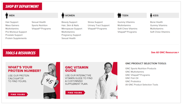
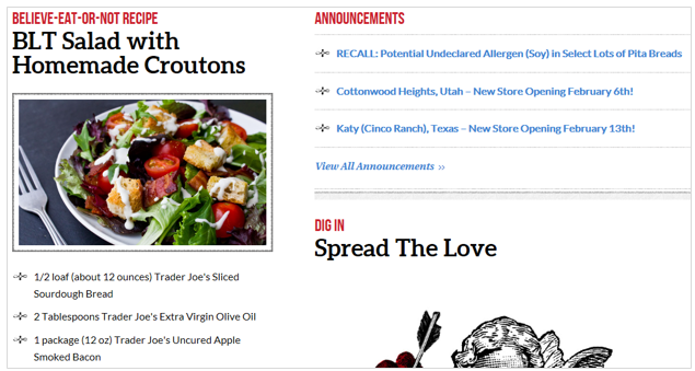
- While blue is still the safest link color, other colors work just as well as long as the links stand out clearly from the body text. If you don’t have a particular reason to prefer another color, we still recommend blue as the safest choice.
- The position of links can help you determine whether or not underlining is necessary. The navigation menu and lists, especially along the peripheral areas of the page, don’t require underlining. Their locations identify them as links.
- Test your color choice for hyperlinks to make sure that people who have colorblindness can spot them easily.
- Static items should not have the same color as hyperlinks.
- Don’t use blue text (or underline text) for nonclickable items.
- Whatever appearance you choose for hyperlinks, make sure to apply the same treatment consistently throughout your site.

Buttons
- Make buttons at least remotely resemble physical buttons. In order for an object to be recognizable, it must retain the right visual cues to trigger the right associations quickly and accurately. Retain the rectangular shape (preferably with rounded corners) if you renounce the 3-D effect. Interactive components in flat design should look clickable even without heavier effects such as shadows and gradients. (In one early study, clicks increased by 416% after changing from flat to 3-D buttons. While the effect is smaller now, it's still big.)
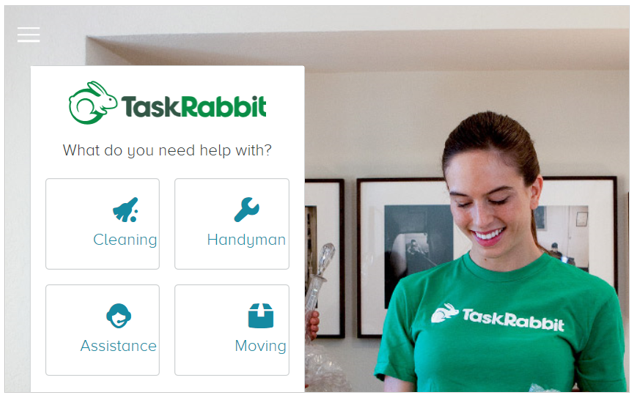
- Conversely, don’t make nonclickable items look like buttons. For example, giving headings a background color will make them resemble buttons when they’re not.
- Focus on content hierarchy within the page. Avoid having many colorful boxes of different sizes on a page. People have difficulty picking out the clickable elements when similar-looking items compete with each other.
Images and Graphics
- Ensure smaller images enlarge when clicked.
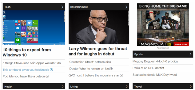
- Make all elements (e.g., picture, icon, text) that are associated with each other clickable. Doing so increases the target size and improves the probability of capturing an intended click.
- Avoid multiple calls to action for a given image unless the options within that image are plainly presented, such as a bulleted list of hyperlinks or clearly labeled buttons.
Symbols and Icons
- When using icons for links, make sure icons are instantly recognizable. Unless you have a really strong resemblance icon or an icon that has become standard, it should be combined with another visual cue, such as a text label, to indicate clickability.
An arrow icon may help suggest clickabilty when no other clickability cues are present. However, this is the least favorable approach because the arrow is not a standard cue and it is too subtle for some people to recognize. If you decide to go this route, make sure you use arrows sparingly, as they can defeat the purpose of keeping your interface simple.
Conclusion
Encourage site engagement by designing clickable items so that users recognize them easily. Although it’s fine to veer away from traditional link design to denote clickability, straying too far from familiar patterns can be problematic.


