
Android has been with us in one form or another for more than eight years. During that time, we've seen an absolutely breathtaking rate of change unlike any other development cycle that has ever existed. When it came time for Google to dive in to the smartphone wars, the company took its rapid-iteration, Web-style update cycle and applied it to an operating system, and the result has been an onslaught of continual improvement. Lately, Android has even been running on a previously unheard of six-month development cycle, and that's slower than it used to be. For the first year of Android’s commercial existence, Google was putting out a new version every two-and-a-half months.
Looking back, Android's existence has been a blur. It's now a historically big operating system. Almost a billion total devices have been sold, and 1.5 million devices are activated per day—but how did Google get here? With this level of scale and success, you would think there would be tons of coverage of Android’s rise from zero to hero. However, there just isn’t. Android wasn’t very popular in the early days, and until Android 4.0, screenshots could only be taken with the developer kit. These two factors mean you aren’t going to find a lot of images or information out there about the early versions of Android.
The problem now with the lack of early coverage is that early versions of Android are dying. While something like Windows 1.0 will be around forever—just grab an old computer and install it—Android could be considered the first cloud-based operating system. Many features are heavily reliant on Google’s servers to function. With fewer and fewer people using old versions of Android, those servers are being shut down. And when a cloud-reliant app has its server support shut off, it will never work again—the app crashes and displays a blank screen, or it just refuses to start.
Thanks to this “cloud rot," an Android retrospective won’t be possible in a few years. Early versions of Android will be empty, broken husks that won't function without cloud support. While it’s easy to think of this as a ways off, it's happening right now. While writing this piece, we ran into tons of apps that no longer function because the server support has been turned off. Early clients for Google Maps and the Android Market, for instance, are no longer able to communicate with Google. They either throw an error message and crash or display blank screens. Some apps even worked one week and died the next, because Google was actively shutting down servers during our writing!To prevent any more of Android's past from being lost to the annals of history, we did what needed to be done. This is 25+ versions of Android, a myriad of devices, and lots and lots of screenshots cobbled together in one space. This is The History of Android, from the very first public builds to today.
Read it your way
In addition to seeing no ads, Ars Technica premier subscribers can download a (free) PDF version of any article or view any article as a single page.
> View Android History as a single page
> Download the Android History PDF
Table of Contents
- Android 0.5, Milestone 3—the first public build
- Android 0.5, Milestone 5—the land of scrapped interfaces
- Android 0.9, Beta—hey, this looks familiar!
- Android 1.0—introducing Google Apps and actual hardware
- Android 1.1—the first truly incremental update
- Android 1.5, Cupcake—a virtual keyboard opens up device design
- Google Maps is the first built-in app to hit the Android Market
- Android 1.6, Donut—CDMA support brings Android to any carrier
- Android 2.0, Éclair—blowing up the GPS industry
- The Nexus One—enter the Google Phone
- Android 2.1—the discovery (and abuse) of animations
- Android 2.1, update 1—the start of an endless war
- Android 2.2 Froyo—faster and Flash-ier
- Voice Actions—a supercomputer in your pocket
- Android 2.3 Gingerbread—the first major UI overhaul
- Android 3.0 Honeycomb—tablets and a design renaissance
- Google Music Beta—cloud storage in lieu of a content store
- Android 4.0, Ice Cream Sandwich—the modern era
- Google Play and the return of direct-to-consumer device sales
- Android 4.1, Jelly Bean—Google Now points toward the future
- Google Play Services—fragmentation and making OS versions (nearly) obsolete
- Android 4.2, Jelly Bean—new Nexus devices, new tablet interface
- Out-of-cycle updates—who needs a new OS?
- Android 4.3, Jelly Bean—getting wearable support out early
- Android 4.4, KitKat—more polish; less memory usage
- Android Wear
- Android 5.0 Lollipop—The most important Android release ever
- Material Design gives Android (and all of Google) an identity
- ART—The Android Runtime provides a platform for the future
- A system-wide interface refresh
- Job Scheduler whips the app ecosystem into shape
- Device setup gets future-proofed
- Settings
- Android TV
- Android 5.1 Lollipop
- Android Auto
- Android 6.0 Marshmallow
- The new Google App
- Google Now on Tap—a feature that didn't quite work out
- Permissions
- The Fingerprint API
- Behind-the-scenes changes
- Volume and Notifications
- Monthly security updates
- Android 7.0 Nougat, Pixel Phones, and the future
Android 0.5, Milestone 3—the first public build
Before we go diving into Android on real hardware, we're going to start with the early, early days of Android. While 1.0 was the first version to ship on hardware, there were several beta versions only released in emulator form with the SDK. The emulators were meant for development purposes only, so they don’t include any of the Google Apps, or even many core OS apps. Still, they’re our best look into the pre-release days of Android.
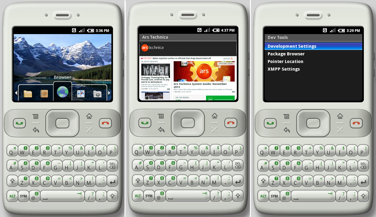
Before whimsical candy code names and cross-promotional deals with multinational food corporations, the first public release of Android was labeled "m3-rc20a"—"m3" standing for "Milestone 3." While Google may not have publicized the version number—and this build didn't even have a settings app to check—the browser user agent identifies this as "Android 0.5."
In November 2007, two years after Google acquired Android and five months after the launch of the iPhone, Android was announced, and the first emulator was released. Back then, the OS was still getting its feet under it. It was easily dismissed as "just a BlackBerry clone." The emulator used a qwerty-bar skin with a 320x240 display, replicating an actual prototype device. The device was built by HTC, and it seems to be the device that was codenamed "Sooner" according to many early Android accounts. But the Sooner was never released to market.
According to accounts of the early development days of Android, when Apple finally showed off its revolutionary smartphone in January 2007, Google had to "start over" with Android—including scrapping the Sooner. Considering the Milestone 3 emulator came out almost a year after Apple's iPhone unveiling, it's surprising to see the device interface still closely mimicked the Blackberry model instead. While work had no doubt been done on the underlying system during that year of post-iPhone development, the emulator still launched with what was perceived as an "old school" interface. It didn't make a good first impression.
At this early stage, it seems like the Android button layout had not been finalized yet. While the first commercial Android devices would use “Home," “Back," “Menu," and “Search" as the standard set of buttons, the emulator had a blank space marked as an "X" where you would expect the search button to be. The “Sooner" hardware prototype was even stranger—it had a star symbol as the fourth button.
There was no configurable home screen or widgets, just a simple dock of icons at the bottom that could be cycled through or tapped on. While touch screen support worked for some features, Milestone 3 was primarily controlled with a five-way d-pad—an anachronism that Android still supports to this day. Even this early version of Android could do animations. Icons would grow and shrink as they entered and exited the dock’s center window.
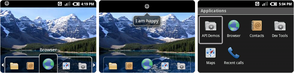
There was no notification panel yet, either. Notification icons showed up in the status bar (shown above as a smiley face), and the only way to open them was to press "up" on the d-pad while on the home screen. You couldn't tap on the icon to open it, nor could you access notifications from any screen other than home. When a notification was opened, the status bar expanded slightly, and the text of the notification appeared in a speech bubble. Once you had a notification, there was no manual way to clear it—apps were responsible for clearing their own notifications.
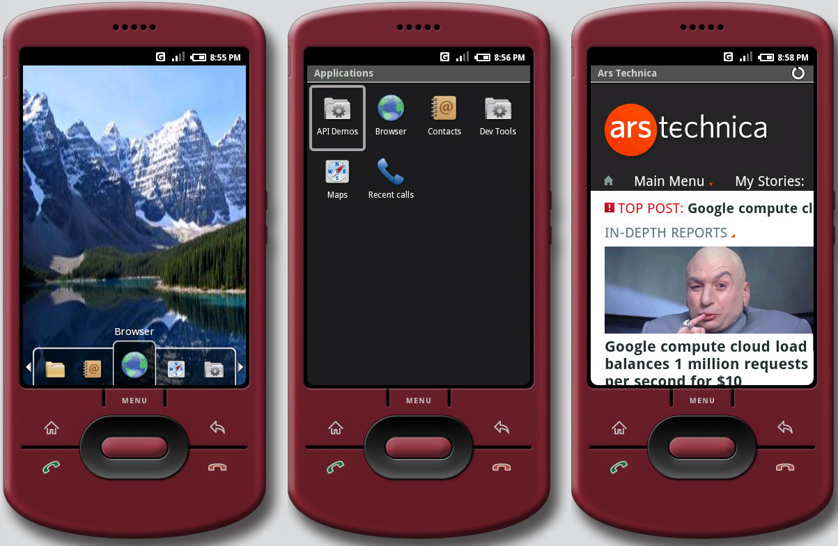
App drawer duties were handled by a simple "Applications" folder on the left of the dock. Despite having a significant amount of functions, the Milestone 3 emulator was not very forthcoming with app icons. "Browser," "Contacts," and "Maps" were the only real apps here. Oddly, "recent calls" was elevated to a standalone icon. Because this was just an emulator, icons for core smartphone functionality were missing, like alarm, calendar, dialer, calculator, camera, gallery, and settings. Hardware prototypes demoed to the press had many of these, and there was a suite of Google Apps up and running by this point. Sadly, there’s no way for us to look at them. They’re so old they can't connect to Google’s servers now anyway.
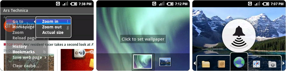
The now-deprecated menu system was up and running in Milestone 3. Hitting the hardware menu button brought up a gray list with a blue gradient highlight, complete with hardware keyboard shortcuts. In the screenshot above, you can see the menu open in the browser. Going to a second level, like the zoom menu, turned the first level of the menu oddly transparent.
Surprisingly, multitasking and background applications already worked in Milestone 3. Leaving an app didn't close it—apps would save state, even down to text left in a text box. This was a feature iOS wouldn’t get around to matching until the release of iOS 4 in 2010, and it really showed the difference between the two platforms. iOS was originally meant to be a closed platform with no third-party apps, so the platform robustness wasn’t a huge focus. Android was built from the ground up to be a powerful app platform, and ease of app development was one of the driving forces behind its creation.
Before Android, Google was already making moves into mobile with WAP sites and J2ME flip phone apps, which made it acutely aware of how difficult mobile development was. According to The Atlantic, Larry Page once said of the company’s mobile efforts “We had a closet full of over 100 phones, and we were building our software pretty much one device at a time.” Developers often complain about Android fragmentation now, but the problem was much, much worse before the OS came along.
Google’s platform strategy eventually won out, and iOS ended up slowly adding many of these app-centric features—multitasking, cross-app sharing, and an app switcher—later on.
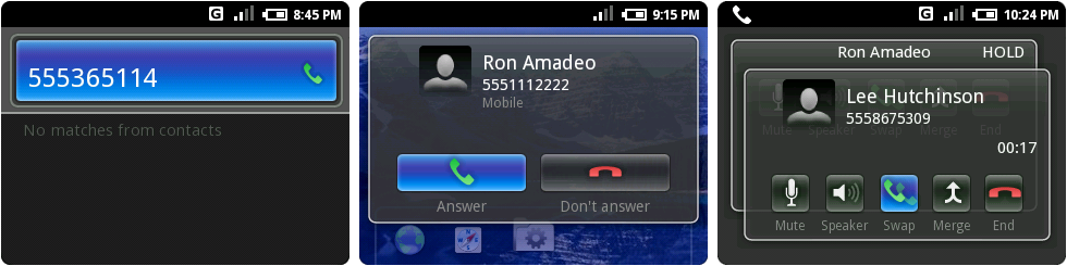
Despite not having a dialer icon, Milestone 3 emulator was equipped with a way to make phone calls. Pressing anything on the keyboard would bring up the screen on the left, which was a hybrid dialer/contact search. Entering only numbers and hitting the green phone hardware button would start a phone call, and letters would search contacts. Contacts were not searchable by number, however. Even a direct hit on a phone number would not bring up a contact.
Incoming calls were displayed as an almost-full-screen popup with a sweet transparent background. Once inside a call, the background became dark gray, and Milestone 3 presented the user with a surprisingly advanced feature set: mute, speakerphone, hold, and call conferencing buttons. Multiple calls were presented as overlapping, semi-transparent cards, and users had options to swap or merge calls. Swapping calls triggered a nice little card shuffle animation.
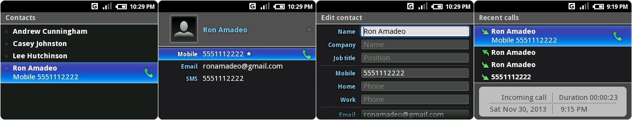
Contacts was a stark, black and blue list of names. Contact cards had a spot for a contact picture but couldn't assign one to the space (at least in the emulator). The only frill in this area was XMPP presence dots to the left of each name in Contacts. An always-on XMPP connection has traditionally been at the heart of Android, and that deep integration already started in Milestone 3. Android used XMPP to power a 24/7 connection to Google’s servers, powering Google Talk, cloud-to-device push messaging, and app install and uninstall messages.
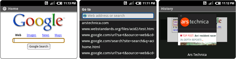
The browser ran Webkit 419.3, which put it in the same era as Mac OS X 10.4's Safari 2. The homepage was not Google.com, but a hard-coded home.html file included with Android. It looked like Google.com from a thousand years ago. The browser's OS X heritage was still visible, rendering browser buttons with a glossy, Aqua-style search button.
The tiny BlackBerry-style screen necessitated a separate address bar, which was brought up by a "go to" option in the browser's menu. While autocomplete didn't work, the address bar live searched your history as you typed. The picture on the right was the History display, which used thumbnails to display each site. The current thumbnail was in front of the other two, and scrolling through them triggered a swooping animation. But at this early stage, the browser didn’t support multiple tabs or windows—you had the current website, and that was it.
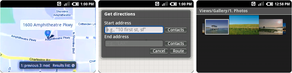
From the beginning, Google knew maps would be important on mobile, even shipping a Maps client on the Milestone 5 emulator. That version of Google Maps was the first thing we came across that died from cloud rot. The client can't load information from Google’s servers, so the map displayed as a blank, gray grid. Nothing works.
Luckily, for the first screenshot above, we were able to piece together an accurate representation from the Android launch video. Old Google Maps seemed fully prepared for a non-touch device, listing hardware key shortcuts along the bottom of the screen. It’s unclear if places worked, or if Maps only ran on addresses at this point.
Hidden behind the menu were options for search, directions, and satellite and traffic layers. The middle screenshot is of the directions UI, where you could even pick a contact address as a start or end address. Maps lacked any kind of GPS integration, however; you can't find a "my location" button anywhere.
While there was no proper gallery, on the right is a test view for a gallery, which was hidden in the "API Demos" app. The pictures scrolled left and right, but there was no way to open photos to a full screen view. There were no photo management options either. It was essentially a test of a scrolling picture view.
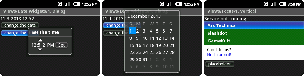
There was also no settings app, but we can look at the original time and date pickers, thanks to the API Demos. This demonstrates how raw a lot of Android was: kerning issues all over the place, a huge gap in between the minute digits, and unevenly spaced days of the week on the calendar. While the time picker let you change each digit independently, there was no way to change months or years other than moving the day block out of the current month and on to the next or previous month.
Keep in mind that while this may seem like dinosaur remnants from some forgotten era, this was only released six years ago. We tend to get used to the pace of technology. It's easy to look back on stuff like this and think that it was from 20 years ago. Compare this late-2007 timeframe to desktop OSes, and Microsoft was trying to sell Windows Vista to the world for almost a year, and Apple just released OS X 10.5 Leopard.
One last Milestone 3 detail: Google gave Ars Technica a shoutout in the Milestone 3 emulator. Opening the “API Demos" app and going to "Views," "Focus," then "Vertical" revealed a test list headlined by this very Website.
Two months later, in December 2007, Google released an update for the Milestone 3 emulator that came with a much roomier 480×320 device configuration. This was tagged "m3-rc37a." The software was still identical to the BlackBerry build, just with much more screen real estate available.
reader comments
212