
Forms are a crucial part of the web design in 2015 – particularly since the rise of mobile has forced us to concentrate that much harder on smoothing our small-screen user experiences.
They are central to driving conversions in ecommerce sites and good from design is often the difference between a successful user registration and losing them from the site permanently.
From a user perspective, forms need to clearly communicate to the user what is required from them. They should be effortless to click into and type in, regardless of the device that they’re accessed on. And they should display with correctly aligned labels that indicate what the user needs to enter into a given field.
While it was once considered standard practice to ask for as much information as possible – on the off chance you may need this information later – that’s not the case today. Forms should be not a character longer than is absolutely necessary.
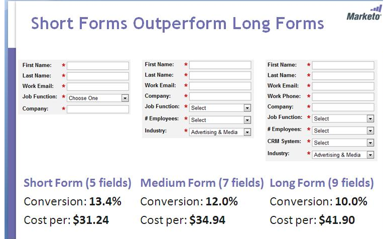
Research has shown that shorter forms can increase conversions by as much as 160%, so a poorly designed form, or one that demands too much data can directly impact revenue.
Users Don’t Like Registering
Users are growing increasingly resistant to traditional registration processes, and studies have shown that up to 86% of people will change their behavior if they are forced to create a user account.
A study conducted by Blue Research further found that, when questioning users:
- 54% stated they might leave the site
- 26% said they would choose another site that didn’t require registration
- 6% said they would leave and avoided the site in the future
- 14% stated that they would complete registration
Further to this, 88% said that they have given incorrect information on a form when registering on a site and 90% said that rather than retrieve account information from a site they had previously registered on, they simply left.
The consistent message from users is clear: they prefer to not register and will avoid it if at all possible. What’s more, this resistance is also growing. Given the choice over account creation, many users would more happily use social logins for all of their accounts.
So, we know forms need to be short, simple and while it’s sometimes handy to have a lot of information about customers from the business perspective, it’s not valuable if it seriously impacts revenue.
Satisficing
In her article Satisficing: What Does it Mean for Web Forms, Jessica Enders explains that,
The term “satisficing” refers to the human tendency to expend only the minimum amount of energy required to successfully complete a task. This is a subconscious phenomenon: (most of the time) we don’t sit down to do something and think “I’m going to spend the bare minimum on this”.
So when crafting forms, it’s necessary to design with satisficing in mind to help avoid user error. Jessica suggests that in particularly important when it comes to framing your question in the clearest possible way for the user.
To overcome this, you should:
Place frames of reference at the start of questions, rather than the end
This is because the user will stop reading the question as soon as they subconsciously feel that they have the answer.
Jessica states that rather than ask the following question,
Q: Have you lived anywhere else in the past 2 years? (Y/N)
You should instead frame it like this:
In the past 2 years, have you lived anywhere else? (y/n)
This “tells the user what subset of their experience that you’re interested in.” So you should “front load” form questions with the important information in order to ensure that it’s picked up by the user.
Check out the full article for a more detailed explanation of satisficing and how to overcome it in your form design.
Duplicate Fields
It’s not uncommon to see sites that duplicate fields for email addresses and passwords in different positions in their application. Not only does this encourage users to leave, but it can also cause headaches for any users who stores passwords using a password manager.
This is because password manager typically work by hooking into the submission form events and storing field names and values.
If these password fields are given different names when the form is designed, then the password manager will be unable to populate the form as the field name doesn’t match.
This is a common problem and in order to overcome it, Mammal advises you to ensure that password fields (if you really have to include two) are named identically. For sites that don’t request a user password on sign up, but do request a username, Mammal recommends that you use an invisible username field when the user then goes to the site to set a password, as shown below.
<!-- Set password -->

<form action="/signup" method="post">
<input name="username" style="display:none;" type="text" value="{{ username }}"/> <input name="password" placeholder="Password" type="password"/> <input type="submit"/>
</form>
This means that when the form is submitted by the new user, the password manager will be able to see both the username and password field and as such, will be able to store both.
When it comes to duplicate email fields, the majority of sites now understand that these are not only often misused (e.g. copy and pasting what has been entered into the first field) but they also affect conversions detrimentally.
Some, such as Gerry Gaffney, go even further. Gerry says:
I find the requirement to repeat the email address patronising and unnecessary. If I really want something and I mis-enter my email address, I am likely to notice I haven’t received the service I requested. I don’t actually need the sort of hand-holding that a repeated email address implies.
I’m certainly of the view that users no longer need that kind of direction. We’re all accustomed to using web forms now, so leave it out. Instead, consider ways that you can make it easier for users to see what they are typing.
- Include plenty of white space so that type is clear
- Use black type on a white background
- Increase the size of the input field
You could also consider adding a message beneath the email field displaying the current email along
which displays the email address that has been entered, along with a dialogue that states that they should review this address as this is where registration details will be sent.
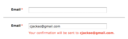
While the image shows the email address in red, this should be approached with caution as some users will assume they have made an error and this could lead to frustration. With this in mind, consider carrying out A/B testing on this particular element, presenting it in different colors.
Form Labels
Form labels and their positioning are one of the most common mistakes made on registration forms, and this has become even more the case since the onset of the mobile revolution.
It’s not uncommon to see form labels that are a little out-of-sync with the form field too when viewing on a mobile device, although it looks completely fine on desktop (usually left-aligned labels, which should be avoided for this reason).
Labels are positioned in a few different ways with the most common options including either above or beside the field. Having labels above the field, whether inside or outside, makes the form twice as long than when labels are beside the field. A longer-looking form may trigger satisficing.
Back in April, Anthony from UX Movement posted that ‘infield top aligned form labels are quickest to scan’ though this is still certainly in contention as Jessica explained in her May follow-up post.
Again, for a comprehensive rundown of the pros and cons of different label positions, see our Definitive Guide.
Further Resources
Forms then are an incredibly important part of design and as such they should be given the attention they deserve. They should be kept as simple to use as possible, and as short as you can get away with. Social registration is desirable, but shouldn’t be prioritized at the expense of slowing the site down and degrading the UX.
Helpful reading:
- Jessica Enders: 3 Rules for Painless Account UX Part One and Part Two
- Jessica Enders: The Definitive Guide to Form Label Positioning
- UX Movement: Why Users Fill Out Less if You Mark Required Fields
- Acquire Convert: Conversion Optimization: An In-depth Guide to Forms
 Kerry Butters
Kerry is a prolific technology writer, covering a range of subjects from design & development, SEO & social, to corporate tech & gadgets. Co-author of SitePoint’s Jump Start HTML5, Kerry also heads up digital content agency markITwrite and is an all-round geek.


