A Tool That Answers 'What's That Typeface?'
A Chrome extension reveals the font choice for the text under your cursor.
The Internet is, from its very core to its most distant peripheries, a vast universe of text.
I was reminded of this fact just this morning as I read the transcript of a conversation between my editor Alexis and Pinterest co-founder Evan Sharp.
"It’s the way the Internet was architected," Sharp said. "HTML is the architecture of the web and it is about the presentation of text. It’s Hyper Text Markup Langauge ... that’s what the code on the Internet does. It marks up text."
Remember: this is from a founder of Pinterest, a supremely visual site. And so for all the GIFs and videos and photographs that are inextricably woven into the culture of the Internet, the experience of being online—how we get from one place to another, what we're doing when we're there—is largely shaped by textual structures. Text is invisibly coded into our interactions with websites and—layered on top of that—it is everywhere in plain sight. But even the text we see, the words you're reading right now, is usually obscured by meaning. Context trumps aesthetic most of the time. For instance, maybe you weren't fixated on the fact that these letters you're scanning are in the typeface Georgia at 16 points. (They are, that is, if you're on a regular old laptop or desktop.) Or that the headline atop this article is in Georgia bold, 34 points.
Which is part of why it's so addicting to be able to mouse over and identify any font you see online. That's what the browser plug-in FontFace Ninja allows. There's even a button that lets you hide everything on the page except for the text. So you can bask in the familiar curves of The New York Times's Cheltenham bold headlines. Or marvel at the confluence of sans serifs on the American Apparel website—Helvetica Neue, Verdana, Arial bold. Or compare uses of Helvetica Neue and Gotham Narrow over at Twitter.
(One limitation: FontFace Ninja only works for text, so an image of text—like a logo—won't register a response. In those cases, sites like WhatTheFont will accept screenshots and identify mystery designs for you.)
Today I learned Vox's chunky sans serif headlines appear in Balto bold. (It also uses a serif called Harriet.) Here's an example of Balto from Vox's website:
The Verge uses both Adelle Regular and some crazy all-caps typeface called FF DIN Web for its headlines. Mashable goes with Museo Slab Regular, which reminds me of a distant cousin of Courier New. Go to The Atlantic homepage and you'll find a mix: Times New Roman bold, Helvetica Neue, and Arial. (And then there's The Atlantic logo, which, in fact, we modified slightly last year. It's a custom font based on a condensed, italic Bauer Bodoni.) The other cool thing about FontFace Ninja is it not only tells you what font you're seeing but lets you test out whatever you encounter. Activate the plug-in, put your cursor over a font that interests you, and click: There, at the top of your browser window, is an area where you can type whatever you want in that same style.
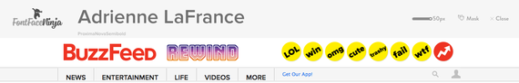
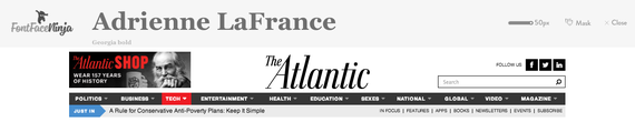
It's a fun tool because it reveals some of the nuances of a typeface that don't typically stand out. By using FontFace Ninja to type my name in BuzzFeed's go-to Proxima Nova Semibold, I could appreciate how abruptly the arc of a lowercase "r" ends compared with the more bulbous body of Georgia bold, which we use for article headlines at The Atlantic.
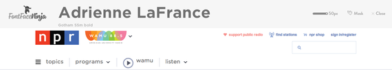
And note how NPR's lowercase "r" differs in the font it uses for headlines (Gotham SSm bold) compared with the network's iconic logo (Trebuchet bold).
(Oh, and for what it's worth, FontFace Ninja uses the Futura-esque Brandon Grotesque bold on its own site.)
When you start thinking about the way words look, and how the shape of each one influences the way you feel about what you're reading, it's hard to stop. Pause for a minute and look around. Letters are everywhere, which means we're surrounded by typographical choices almost all the time.
"All of us, I would suggest, are prompted in subliminal ways," British design writer Rick Poynor says in the 2007 documentary, Helvetica. Helvetica is so popular, some graphic designers theorize, because it represents the culmination of a long-developing line of design reasoning.
"Maybe the feeling you have when you see particular typographic choices used on a piece of packaging is just, 'I like the look of that. That feels good. That's my kind of product,'" Poynor said. "But that's the type casting its secret spell."
And that's the thing about design. We don't always see it, even when we're staring directly at it.