How Atlas, a project from Quartz, can help you organize your data and build various graphs and charts
Update: Today, Quartz opened Atlas, its repository for the charts and graphs its built since the news outlet’s inception, to everyone. Below, we offer a dissection of a handful of the charts up on Atlas so digital storytellers can learn how to organize their data to build charts like Quartz’s. This tutorial originally ran on June 29, 2015.
“I have a lot of data and I want to build a chart but I don’t know how.” We hear this a lot and we want to help.
Luckily, Quartz recently unveiled Atlas, a repository for sharing the thousands of charts it has built over the years. Atlas is perfect for understanding the kinds of charts one can use to communicate data as well as learning how to structure your data. It was built for that kind of transparency.
“You can now download the data behind our charts, embed our charts elsewhere on the web, grab an image of our charts, and of course share our charts on social media,” writes Zach Seward, VP of product and executive editor at Quartz. Why would Quartz do this? Nieman Lab has a good write-up, arguing that the company is positioning itself to start offering “sponsored charts” for native advertising.
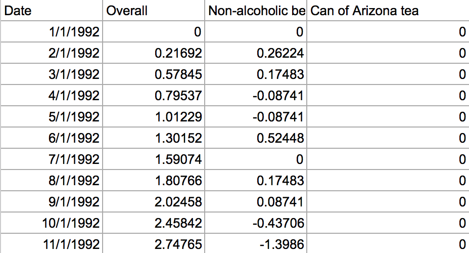
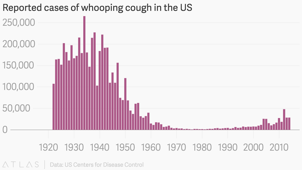
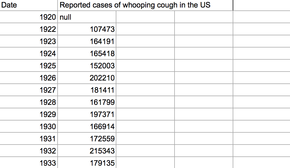
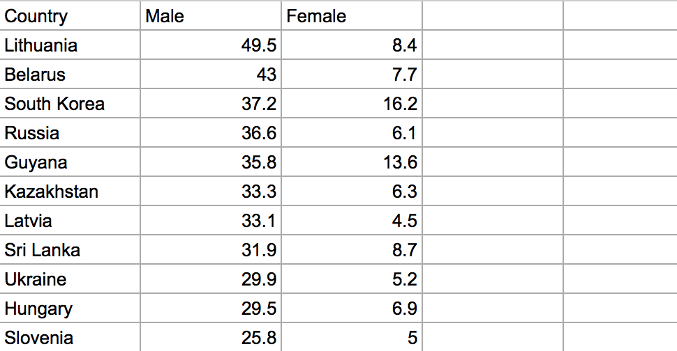
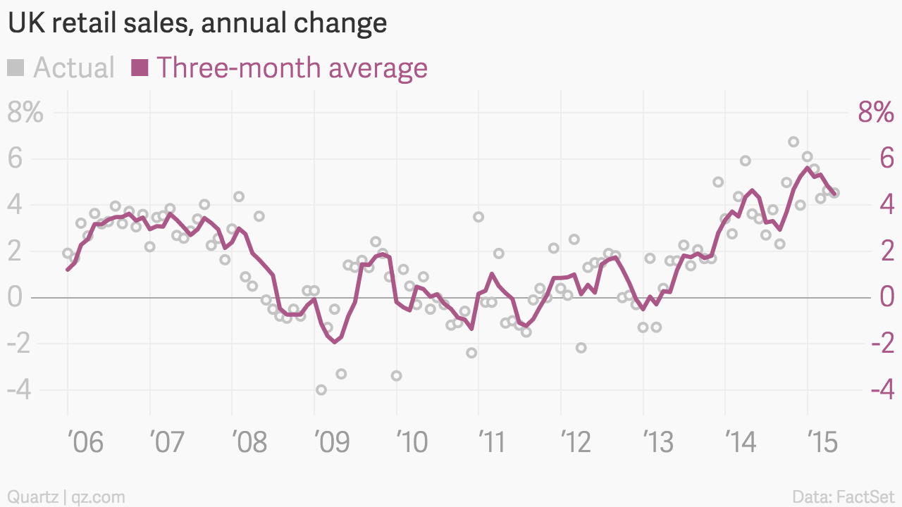
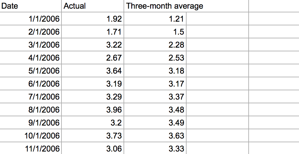
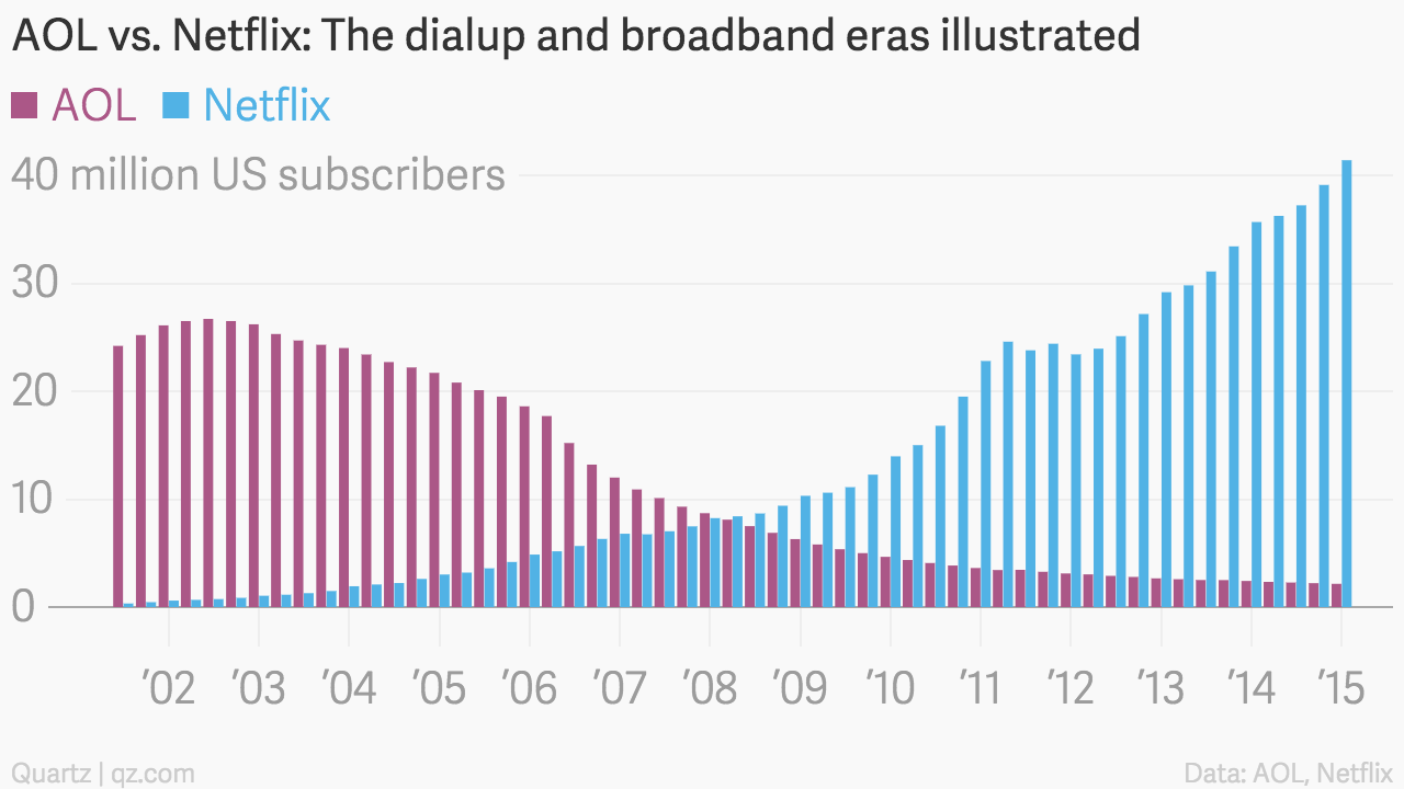
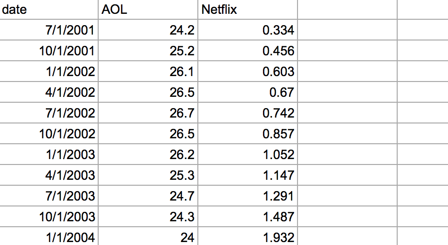
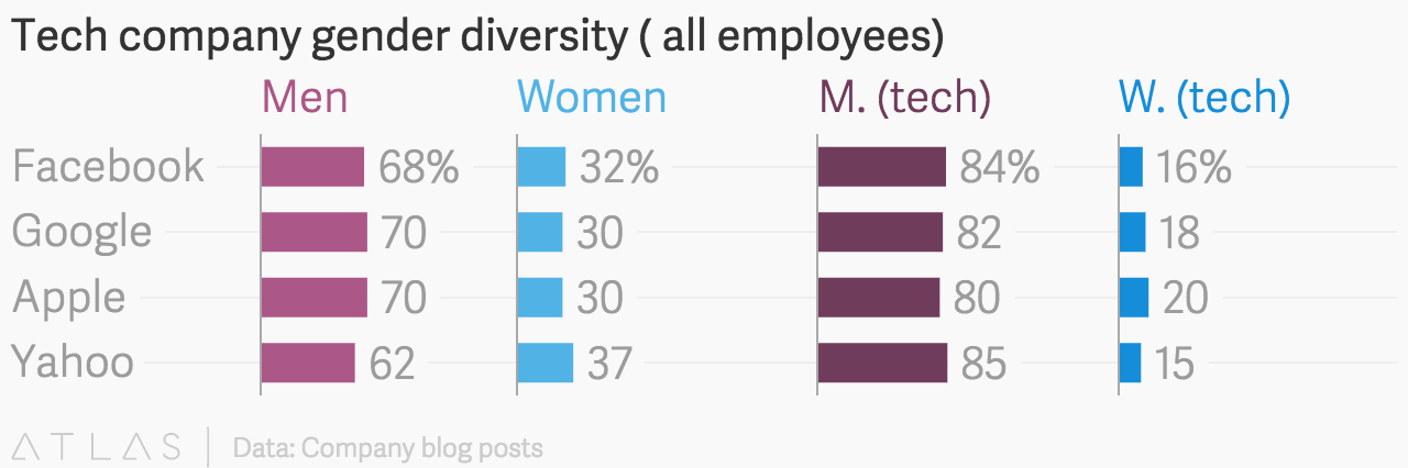
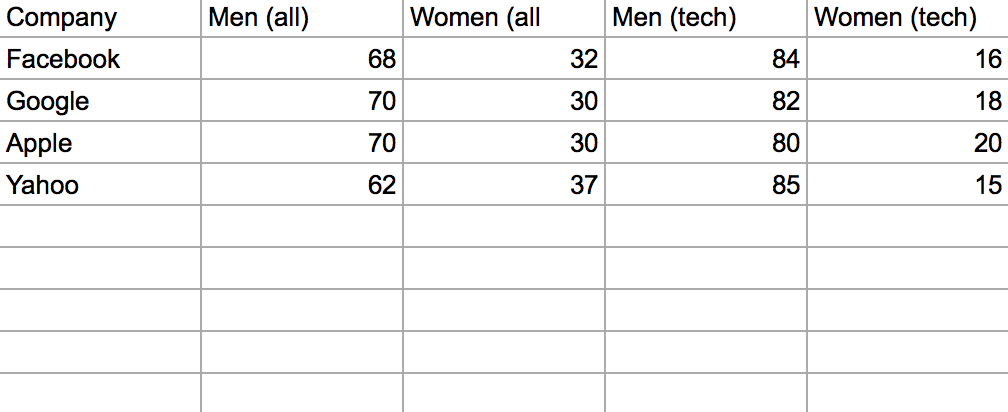
Storybench decided to pry open a few of Quartz‘s charts so readers could understand how data is organized and structured. To view the data, click the spreadsheet next to its corresponding chart. Try charting the data yourself with Quartz’s Chartbuilder or another visualization tool like Plotly, Silk.co, Datawrapper or even Google Spreadsheets’ charts.