Why Samsung’s design sucks, in a single image
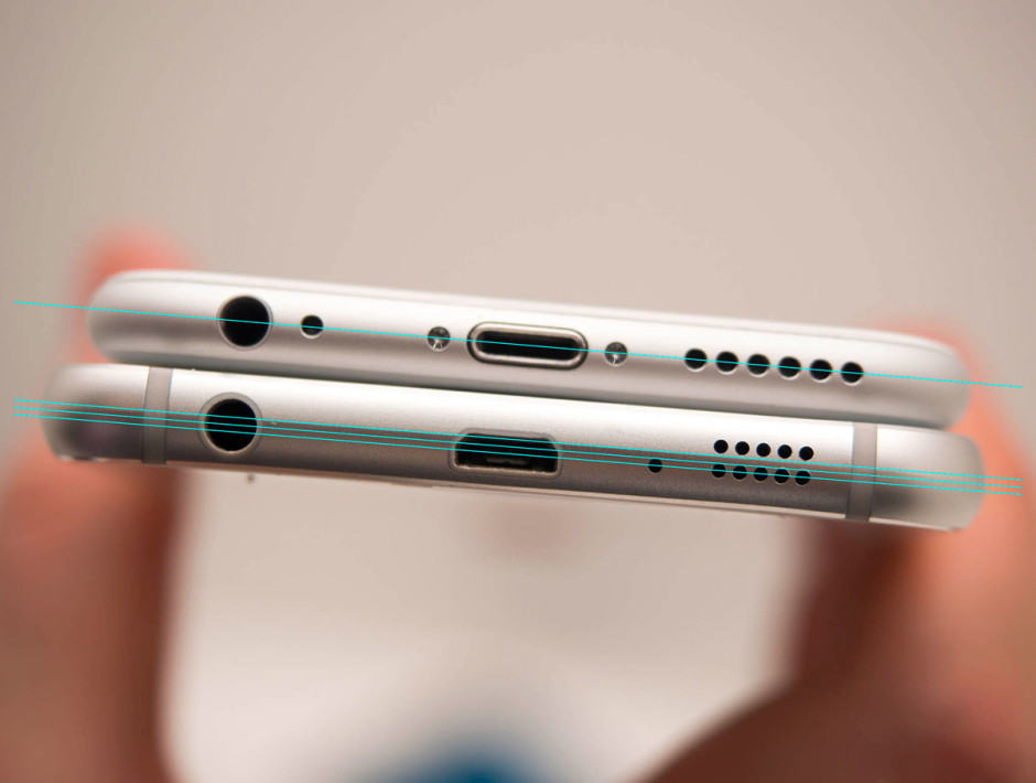
The difference between Apple and Samsung, in a single image. Photo: iMore
Want to sum up the difference between Apple and Samsung in a single image?
Don’t look at the logos. Don’t look at the operating systems. Don’t even look at what their respective gadgets look like.
Look at the lines. Look at the symmetry. Because Samsung can’t even get these basic things right.
Once you start looking closely, even Samsung’s best phones look like they were designed by a kindergartner.
Over at iMore, Rene Ritchie points out something that has been bugging him ever since he got his hands on a Samsung Galaxy S6 Edge: every single port and button on the device just seems like it was randomly slapped on.
“Recently there was a brouhaha about a Qualcomm sticker junking up the Samsung Galaxy S6 on Verizon. You don’t see a sticker like that on the iPhone 6 or any other iPhone, of course, because Apple cares more about the look of their product than the licensing fees or other considerations refusing it entails. Same with Intel Inside stickers on the Mac.
But when I looked at the picture of Samsung’s product, it wasn’t the sticker that bothered me so much. That, I assume, can be peeled off. It was something else I saw that bothered me, and something I can now never un-see.
It’s the lack of basic alignment.”
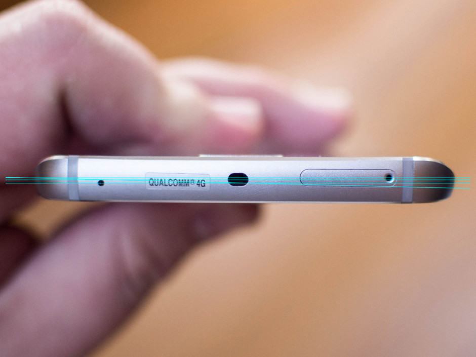
Jeez, Samsung. Photo: iMore
To prove his point, Ritchie proceeds to draw lines through all the major buttons, ports, and holes on the sides of Samsung’s and Apple’s flagship smartphones. In every instance, Apple’s lines run straight through the middle of every hole. Samsung’s lines, meanwhile, look like a drunk person drew them.
It’s a small thing, but once you see it, you can’t unsee it. How did a company this sloppy get to be Android’s premier smartphone maker?
Source: iMore

