

Between my sophomore and junior year of college, I interned at a marketing company in their design department. On the first day of my internship, I was shown to my temporary working space where the company’s brand style guide was waiting for me on my desk. It was a quick way for me to learn the design standards for the company’s brand, and it made it much easier for the designers and interns to stay on the same page and create a cohesive visual identity across all platforms and mediums.
When I started at my first full-time graphic design position right out of college, I opened my inbox on my first day to find an online PDF of the company’s brand style guide. And again, it was a quick design reference that I returned to time and time again.
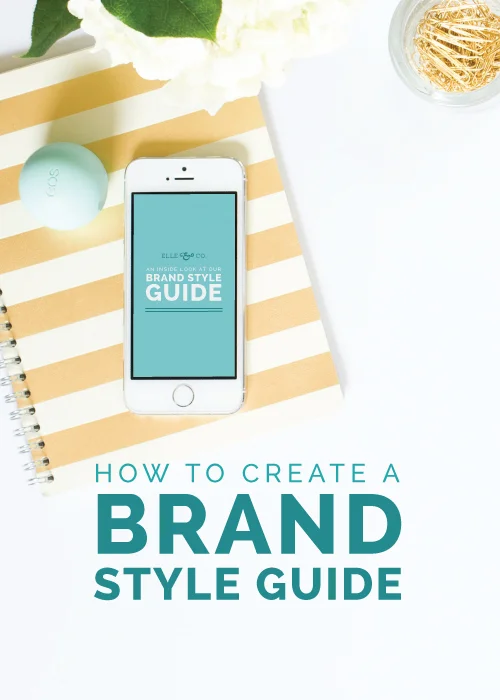
After deciding to start Elle & Company, I outlined my brand standards within a style guide. And today I’m teaching you how to do the same for your blog or business.
While you may not have a large team of designers working for you, creating a style guide will help you maintain visual consistency and display professionalism through every detail of your brand. It’s also much easier to tackle new design projects when you have a framework to work within.
Logo variations
Many brands have a primary logo as well as one or two alternative logos to give them versatility. When designing for clients, I focus on designing a primary logo to be used on the website, business cards, and other important materials. The alternative logos are used when the dimensions or orientation of the primary logo isn’t a good fit or needs to be sized down (think profile pictures, favicons, etc.).
It’s important to outline how and when each logo variation should be used to maintain professionalism and consistency throughout your brand. Consider these questions:
- Will the logo appear the same for both web and print?
- What will the logo look like on a white background? What will the logo look like on a colored background? What will the logo look like on a photo background?
- How much space needs to be left around the logo?
- Can there be a drop-shadow added to your logo? Can your logo be embossed or embellished in any way?
- Can your logo be rotated or displayed sideways?
- Does your logo have different color variations?
- What is the minimum size of your logo?
This may seem a little detailed and excessive, but it’s important to consider these things outright to maintain a streamlined brand.
Related Posts: The Do's and Don'ts of Logo Design, 5 Characteristics of Iconic Logos
Fonts
I’ve seen many businesses and blogs who are all over the place with their font choices, making their websites overwhelming and difficult to read. In order to cut down on confusion and create consistency on both web and print materials, consider these questions:
- What is your body font for web? What is your body font for print? What are the sizes for each?
- What is your header font for web? What is your header font for print? What are the sizes for each?
- If your main fonts can’t be used for any reason, what are your alternative fonts?
- Can your fonts be bold or italicized?
- How much spacing needs to be left between characters (tracking) and lines of text (leading)?
- Are there specific character styles (like all caps) for any of your fonts or text styles?
Designer note: I usually recommend no more than 2-3 font choices per brand, just to keep things simple, professional, and streamlined.
Related Posts: My Top 23 Favorite Fonts, The 411 on Type
Colors
I'm also surprised by the number of entrepreneurs and bloggers who use the little color-picker for their websites instead of using the exact color values for their brand. To streamline your colors and ensure that they're the same tint and shade across all platforms, think through the following questions:
- What are your primary brand colors? What are they used for?
- What are your secondary brand colors? What are they used for?
- What are the CMYK, RGB, and hexadecimal values for each color? (This makes it easy to streamline your colors and also provides a quick reference)
- What color is your body text? What color are your headers?
Related posts: The Psychology of Color in Branding
Patterns, borders, and illustrative elements
You might be seeing a trend here with all of these questions, but my goal is to have you thinking through every detail about your brand and setting intentional guidelines. This carries through to smaller brand elements like patterns, borders, and illustrative elements.
- What is the graphic style of your brand? Simple? Edgy? Artistic?
- When and on what mediums should illustrations, patterns, and borders be used?
Photos
Your images reflect your brand just as much as other graphic elements like your logo, fonts, and colors. Consider the following as you put together your brand style guide:
- What is the photographic style of your brand? Bright? High contrast? Saturated?
- Can type be incorporated with photography?
- When and where should photos be used within your brand?
- Are the photos full-bleed or should there be a border around each one?
- What are the subjects of your photos?
As you're thinking through these questions, strive to be as detailed possible to make it easier on you in the long run; becoming intentional about the details makes for a more cohesive, professional brand.
The Elle & Company Brand Style Guide
I always think it's helpful to see an example! Click here to take a peek at the latest version of the Elle & Company brand style guide. You can also scroll through the posts below and take a look at my most recent brand style boards for my design clients.
Do you have a brand style guide? How has it benefited your blog or business?


