Click! You have a visitor. They land on a page and begin navigating around your website. Hopefully, answers are easy to find. Navigation labels are clear. Internal links are useful. The search tool is helpful.
But then they hit a dead end.
These are places where the flow of visitors stops because the page is blank. There are no offers, no information, no reason to stay. Probably, they close the tab or hit the back button.
Here is a quick guide to finding and fixing website dead ends. We’ll list the seven most common dead ends on websites and suggest fixes that keep your visitors flowing.
1. Service pages
Also known as “money pages,” these are the pages that sell. When they include the right key elements, they provide clarity (answer questions, address objections), supportive evidence (social proof, data, success stories) and simple calls to actions that trigger visitor psychology.
These are your most valuable pages and your most qualified visitors. When the visitor starts here, they are 10x more likely to convert into a lead. But many service pages simply end at the footer, without any calls to action. They just stop. If the page was a sales rep on a call, they just hung up the phone.
The best service pages aren’t dead ends. They call on the visitor to act. They suggest getting in touch. They have a final CTA page block, right above the footer.
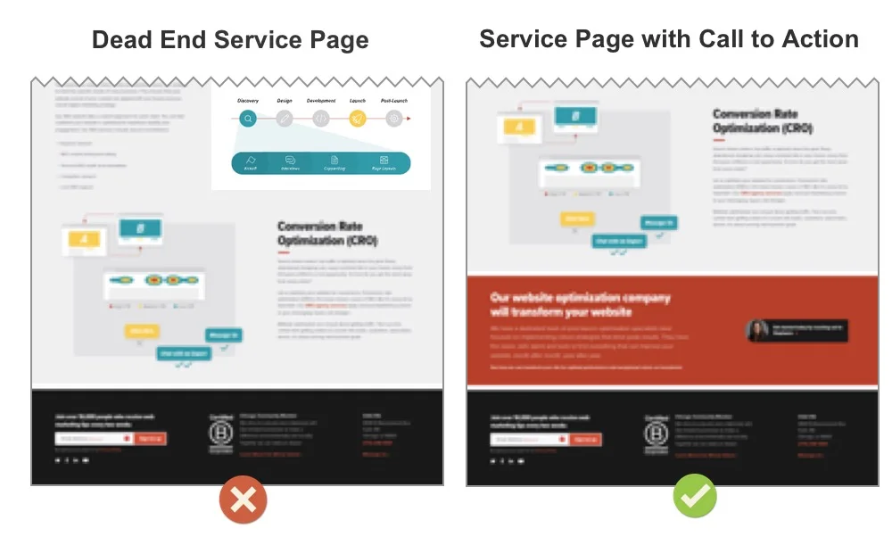
Here are some elements that appear in a call to action page block at the end of a service page.
- A subhead that aligns with the service described on the page (not a generic “get in touch!”)
- A short blurb with a bit more info (who you’re a good fit for, next steps in the process, when you’ll reply, how soon you’ll be able to meet)
- A face of a sales representative
- A CTA button that makes it sound valuable, easy, fast or low-commitment (“schedule a quick demo with an expert”)
If your site suffers from low clickthrough rates on CTAs (or if you don’t know your CTA CTRs) check out this handy guide on buttons and clicks. It’s filled with tips to increase clickthrough rates.
Detours that fix dead end service pages
- Add a lead generation CTA above the footer on every service page
- If the page is very long, consider adding a CTA partway down the page
2. Blog posts
They may not be ready to hire you, but if you impress your blog readers, they’ll think of you when the time is right. You impress them by showing them your best content. You gently guide them toward your articles with 10x the insights. You know the ones.
Internal links within articles are the main way to keep visitors flowing through a blog. But if the reader makes it all the way down, catch them before they hit rock bottom by adding “Related articles” to the bottom of your blog detail page template. Media sites always do this. They know it works.
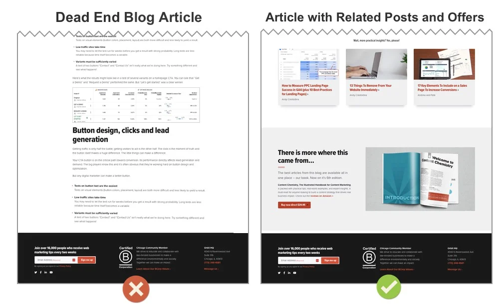
But the subhead doesn’t have to say “Related articles.” You can do better than that. Ours says, “Wait, more practical insights? Yes, please!”
There are many CMS plugins for adding related posts. Some scan your blog then pick the articles automatically. Others let you choose manually. If you can set them by hand, pick related articles that did well in social media (these will likely have high clickthrough rates) or articles with topics that follow logically from the article they just read.
ProTip: Looking for article headlines that have high clickthrough rates and engagement? AI can help you analyze social media data and find the most engaging articles. These will also win clicks when used as related articles.
Do visitors click on Related Articles?
Track it and find out. We added an event to the clicks on ours, allowing us to track the clickthrough rate. Divide the event count by the total sessions on blog URLs and that’s your clickthrough rate. Here I did it in old school Universal Analytics because we haven’t created this event in GA4.
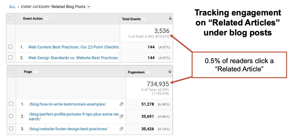
The math shows that 0.5% of people who read an Orbit Media blog post click on a related article. Is that good or bad? It depends on how you look at it.
- Just 1 in 200 people read a related article? That’s terrible.
- 3500+ article views that we wouldn’t have had otherwise? That’s great!
The bottom of the blog detail template is also a great place to offer content in another format. Maybe something big like a guide or book, or something easy like a checklist. This is also the place for the traditional blog UX features like author boxes, share buttons and comments.
What about blog comments?
Blog comments on company websites are rare these days. Engagement in the comments has gotten so low (and spammy) that many blogs, including this one, have removed the comments section entirely. For B2B content, the content-related conversations are on LinkedIn.
Detours that fix dead end blog articles
- Related articles that got traction in social media. Those headlines are probably the ones that will have the highest clickthrough rates.
- Related articles that logically follow this article
- Email Sign up CTA
- Share, comment buttons
- Detailed author box with picture and links
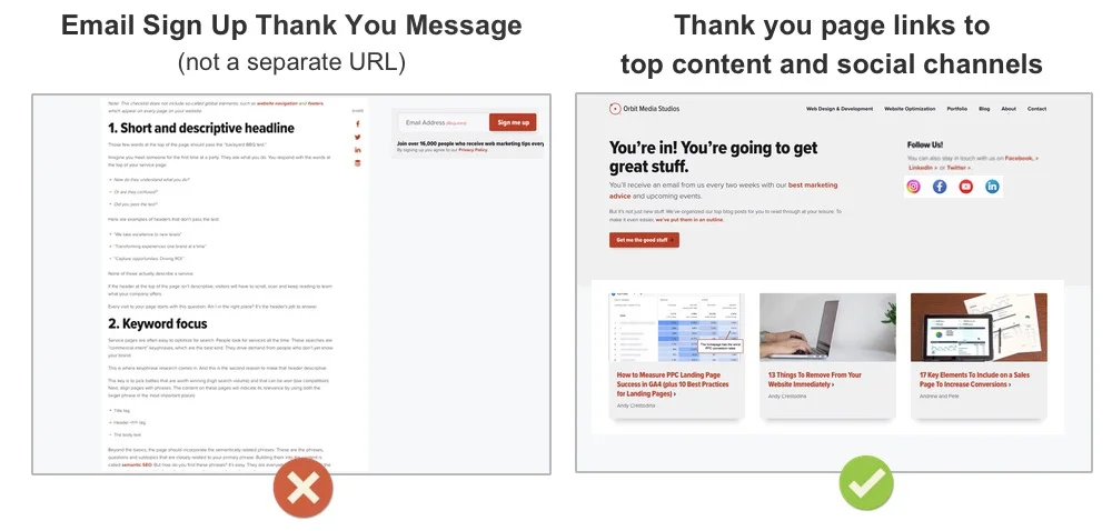
3. Contact form thank you page
The pixels on this screen are literally your first interaction with your new prospect.
This page loads when the visitor converts. At this moment, their interest in your business is peaking. They are likely wondering when they’ll hear from you. They are likely interested in learning more about you and your business. They have questions and motivation. It’s a beautiful moment.
But many thank you pages are dead ends.
They say almost nothing. They have two lonely words at the top: “thank” and “you.” They might as well say “Good bye” or “Now go fill out our competitor’s form in case we don’t get back to you.”
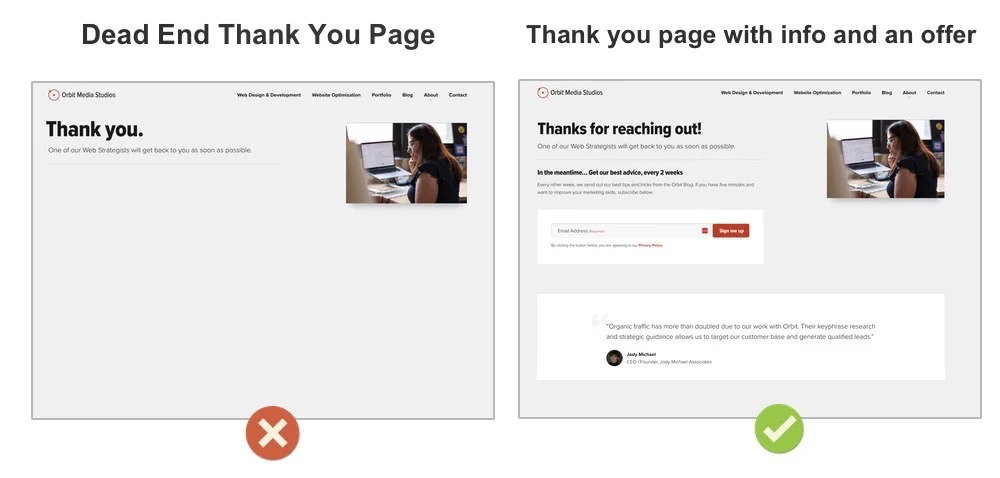
Many B2B lead gen websites don’t use any of the thank you page best practices. But just think of all the things this page could do for your new prospect:
- Set expectations about when you’ll be in touch
- Embed a video telling them more about your business
- Share your best case studies
- Give them a chance to subscribe to your newsletter
That last suggestion is a good one. For years, we’ve had an email sign up form on our contact us thank you page. We track it separately in GA4. Here’s the performance:
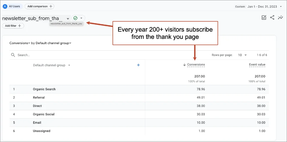
Those are hundreds of subscribers each year that we probably wouldn’t have had. But the ‘who’ is more important than the ‘how many.’ These are hand raisers who are starting a conversation. That’s the most valuable subscriber.
The dead end thank you pages made it on our list of 13 things to remove from your website. There may be other things on that list that you should probably remove.
Detours that fix dead end contact thank you pages:
- Tell the visitor what happens next, with text or video
- Link to case studies or articles that relate directly to your services
- Add an email signup form
4. Newsletter signup thank you page
What about all of your other thank you pages? Such as the newsletter thank you page? Or the webinar signup thank you page? Or the lead magnet download thank you page?
Each is an opportunity.
For starters, each should have a thank you page, not a thank you message. When a visitor fills out a form, the site should bring them to a URL. It’s better in every way: user experience, Analytics, messaging, etc. This is one of the five things that should happen every time a visitor converts into a lead.
- They arrive at thank you page
- They get a thank you email (and possible a drip sequence)
- You get email notification
- They are added to your CRM (leads) or ESP (subscribers)
- They are tracked as a conversion in GA4
Except for number three, all of those things should happen every time a visitor subscribes.
That newsletter sign up thank you page should keep the visitor flowing, giving you more juice from every squeeze. Visitors who subscribed are obviously interested in more content. Suggest your best. Or suggest they follow you on social media. This is one of the few places in all of digital marketing where you want your visitor to leave your website and go to a social platform
These are opportunities for any content conversion. If the visitor downloaded your guide, suggest they register for your webinar. If they registered for your webinar, suggest they schedule a meeting.
On our newsletter sign up thank you page, there’s a button that brings them to a page with our best content, organized into categories. Do visitors click that button? Let’s ask GA4 with a quick path exploration:
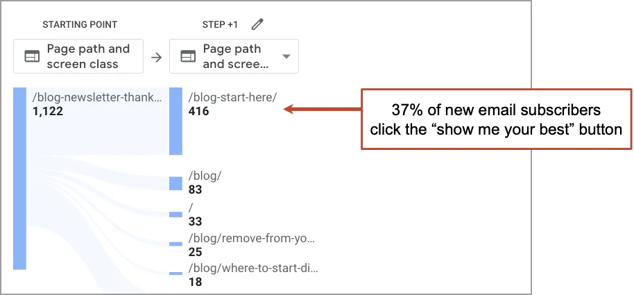
It shows that 37% of new subscribers click to see the content. Imagine if the page was a dead end. What’s the missed opportunity? Thousands of visitors over the years would miss out on valuable, memorable, trust-building articles.
Detours that fix dead end email sign up thank you pages
- Link to the articles with the high clickthrough rate headlines
- Create a “start here” page with your best content, link to it from here
- Link to social media profiles
5. Site search “No Results” page
There are very few places in digital where your visitor tells you exactly what they want from you. Your site search tool is one of them.
But what if you don’t have exactly what they’re looking for? They hit a dead end.
If you’re lucky, they’ll search again. If not, you’ve lost them. They tried browsing, they tried searching, how hard can you expect your visitor to work at this?
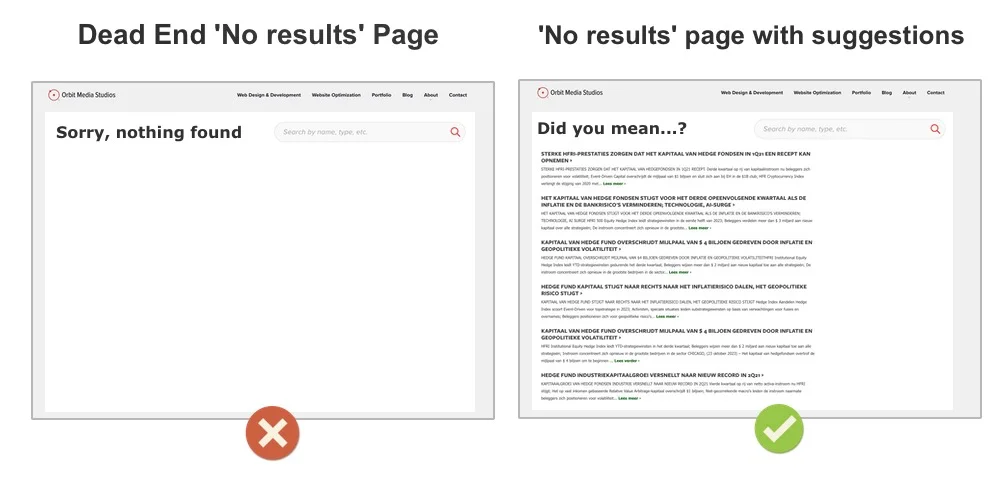
The best “no results” site search results pages give the visitor a path. They show results that are related to the search term. Or they show related categories. Or they simply show the results of common searches.
- “Did you mean… ?”
- Popular Categories
- Search Suggestions
- Top Searches
Site search problems are often difficult to solve. After using Google for so long, visitor expectations are very high. But the free and low-cost site search tools (often WordPress plugins) offer nothing near the predictive intelligence or customizations that would create a Google-like experience.
But there’s no reason not to see how visitors are using your search bar. It takes just a few minutes to set up site search tracking in GA4. That article has a video that shows the steps for setting it up and creating a GA4 exploration that shows what visitors are searching for. Once you know how it’s used, you can measure the size of the issues and opportunities.
Here’s an easier approach with no setup required. It works if your search results page has a URL that includes the site search query parameter:
- Create a free form exploration with “Page path + query string” as the dimension
- Filter to show pages with your search parameter (we use FacetWP so the filter is set to show pages with “fwp_blog_search”)
- Choose “Views” and “Exits” as the metrics
You’re now looking at a summary of successful and failed searches on your website. Every exit is a person who searched for something but left from the search results page. They didn’t click because they didn’t see it. That’s why it’s called “Report of Broken Dreams.”
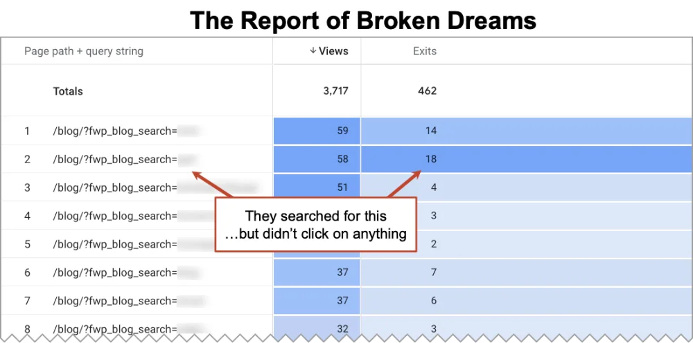
In many cases, you have content for them, but it’s not showing up because it doesn’t use the words they searched for. Just do a bit of SEO for your own content and your own search tool. Problem solved.
We have a complete guide on site search tracking in GA4 which has a more complete approach. The insights and actions can have a huge impact.
Detours that fix dead end site search “No results” pages
- Show the results of the most popular searches
- Suggest other searches
- Optimize your content to rank in your own site search tool for common searches
6. Ecommerce checkout thank you page
Another great example of a first moment of truth. The ecommerce checkout thank you page is the first thing that a new customer sees. Yet on so many ecommerce sites, it’s thin at best, blank at worst.
Ecommerce has a special opportunity on this page: the “create an account” option. Rather than force the visitor to create an account before buying, you can move the account creation option to the thank you page.
“I’m here to buy this product, not create an account.”
Remove the account creation speed bump and let everyone buy with the minimal possible friction. This can improve sales immediately. Then give the account creation offer on the thank you page. In our experience in ecommerce development, this single change can increase sales by 25%.
But will visitors do it? The answer is in your Google Analytics account. Here I’ve created a GA4 funnel exploration for an ecommerce website, with a final post-checkout step for account creation.
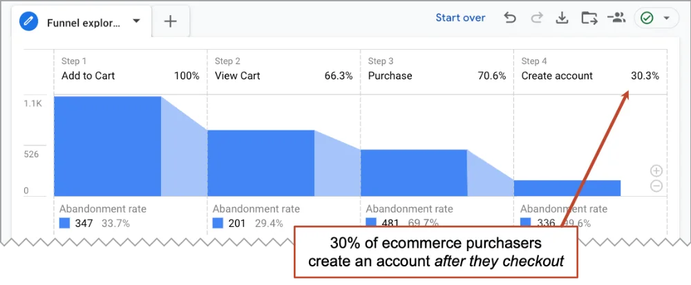
You can see here that 30% of ecommerce buyers created an account on the thank you page. Why? The page gives them reasons to create an account (see order history, track your packages, save shipping addresses) and makes the process easy (just enter a password since we already have the email address).
If nothing else, the ecommerce thank you page should give them the basics that all of us want after buying a product: what I’m getting, when I’ll get it, what if there’s a problem, etc.
Detour that fixes dead end ecommerce thank you pages
- Give them shipping information, delivery expectations, contact info for support
- Put the account creation step here, rather than adding a create account / guest checkout option in front of the cart.
 |
Tom Bowen, Web Site Optimizers“In addition to the account creation on the order confirmation page, there are lots of things you can include on this page. If your range of products is narrow, offer links to installation or setup instructions (or include videos right on the page). Offering links to relevant blog posts can start driving future repeat revenues. I like to tell my store owners to pretend they’ve just made a sale on the phone, and have to continue talking to the customer for two more minutes. What would about their business would they like to tell their new customer about? Take that answer and find the links that talk about that on the website.” |
7. 404 “Page Not Found” page
This last page on our list is one that we wish they’d never see. But it happens on every website. A dead link (internal link or on another website) brings the visitor to a URL that doesn’t exist.
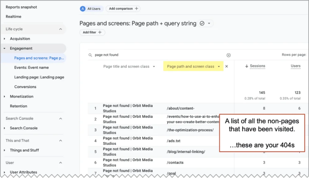
The first job is to find and fix broken links. Here again, GA4 can help. The instructions in this GA4 guide to finding website bugs will show you how to find them all at once. It’s really just the Pages and Screens report set to show the URLs with “Page not found” as the title.
However they got there, what’s on the page is up to us. Look at yours. Is it helpful? Or is it a dead end?
404 pages are sometimes clever. I’ve seen poems, jokes, videos and actual games. But unless the page offers content or links, it’s still a dead end.
The 404 page on this website has links to the portfolio, blog, services and the contact page. According to a quick GA4 path expiration, around 40% of visitors click something.
Detours that fix a dead end 404 page
- Find the URLs of all of the pageviews of your “Page not found page”
- Find and fix all the links to those URLs (internal and external if possible!)
- Improve your 404 page by linking to to your main services and best content best content
Re-route traffic, keep your visitors flowing, then measure.
Driving traffic is hard work. It’s a big job to combine content, SEO, social media and email marketing. You might even pay good money for those visitors.
But once you have them, are you making the most of that visit? Or is your site sending them down one-way, dead-end streets?
And as a final, catch-all last resort, make sure your footer has lots of helpful options. Not sure what to add? Here’s a list of dozens of elements you can add to a footer. It’s your last chance to steer the visitor toward value before then crash into the bottom of the viewport.
The goal of every marketing site is to keep visitors flowing toward conversion, which means success for the visitor and the brand. Find where the flow stops and add the detours.
Once you’ve re-routed traffic and fixed the dead end, check the before and after with a quick GA4 exploration. The impact will appear in clickthrough rates, bounce rates and engagement rates.
Every page on your site should answer this question: “What would I like my visitors to do next?” And the answer should never be “leave my website.”
Interested in learning more? Turn left at one of the related links below…