This article was sponsored by SEO PowerSuite. Thank you for supporting the sponsors who make SitePoint possible.

The telephone became commercially available around 1878, but it took 71 years before half the U.S. households had one. That gave the typical business owner in 1907 50 years to decide whether he needed one installed in his shop.
By comparison, the average business owner in 2007 had only 50 months to prepare for the sudden rise of the smartphone. That may seem like a long time; yet only 6 percent of SMBs have a mobile-friendly website—and 45 percent have no site at all.
If you find yourself on the wrong side of the mobile explosion, no worries. This article will put you on the path to a website that plays nice with mobile visitors.
Why Mobile is Now Mission-Critical
As mentioned in SEO PowerSuite’s recent guide to mobile-friendly sites, 90 percent of users switch between devices to accomplish a goal—mostly shopping. Here’s why mobile is now mission-critical.
1. Mobile has become Mainstream
In 2007, Apple launched the first iPhone. Over the next 12 months, other mobile phone manufacturers began releasing products to compete with it. Today, nearly 75 percent of mobile subscribers in the U.S. own smartphones.
That’s up from 65.2 percent in December 2013—and projected to surpass 80 percent by year end. The smartphone has become mainstream.
2. Mobile Searchers have Higher Purchase Intent
Consumers Use Smartphones to Make Purchase Decisions
Over 50 percent of mobile users reach for their smartphone to decide what to buy and where to buy it. One of the most common secondary actions after searching is a making a phone call.
In fact, mobile searchers made 30 billion inbound sales calls to U.S. businesses in 2013. And that number is growing. According to a recent report, mobile search will generate 73 billion calls to businesses by 2018. The report goes on to say:
After a decade of media adoration, clicks and impressions aren’t valued as highly as a ringing phone to businesses. Calls have become a valuable currency in a world where growing smartphone penetration pairs low funnel purchase intent with a device (the phone) that is ready to make a call.
78 Percent of Local Mobile Searches Turn into Purchases
Another study revealed that 78 percent of consumers who search for a local business on their smartphone end up making a purchase.
3. Mobile Searchers Take Action Sooner
The same study also revealed that three-fourths (76 percent) of those purchases happened the same day, and most (63 percent) within a few hours.
4. Google’s Growing Emphasis on Mobile
This past November—for the first time ever—Google’s mobile traffic exceeded its desktop visits.
Google’s now faced with directing over half it’s users to websites that do not display properly on a mobile device. This gives its users a bad experience and reflects poorly on the company. Which is why they are pushing businesses and organizations to make mobile-friendly websites.
Mobile-Friendly is about to Become a Ranking Factor
In November 2014, Google announced that mobile-friendly websites will get a “mobile-friendly” label in their mobile search results.
We see these labels as a first step in helping mobile users to have a better mobile web experience. We are also experimenting with using the mobile-friendly criteria as a ranking signal.
The “experiment” is over. On April 21, Google will officially begin using mobile-friendly criteria as a ranking signal in mobile search results.
Red “Slow Labels”
In 2010, Google added page speed as a ranking factor. Last month, Search Engine Roundtable reported a red “slow” label appearing in a mobile search result.
Although no official word has come from Google, it’s not unreasonable to assume they are testing a new label warning users that a particular web page is slow to load.
What is a Mobile-Friendly Website?
Here’s Google’s criteria for a mobile-friendly website:
- Avoids software that is not common on mobile devices, like Flash
- Uses text that is readable without zooming
- Sizes content to the screen so users don’t have to scroll horizontally or zoom
- Places links far enough apart so that the correct one can be easily tapped
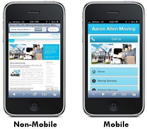
Having to scroll and zoom is frustrating to mobile users. In fact, 61 percent will leave your site if it’s not mobile-friendly … and go to a competitor’s whose is.
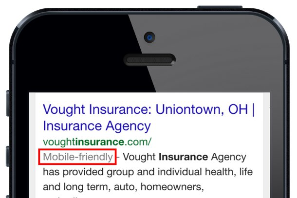
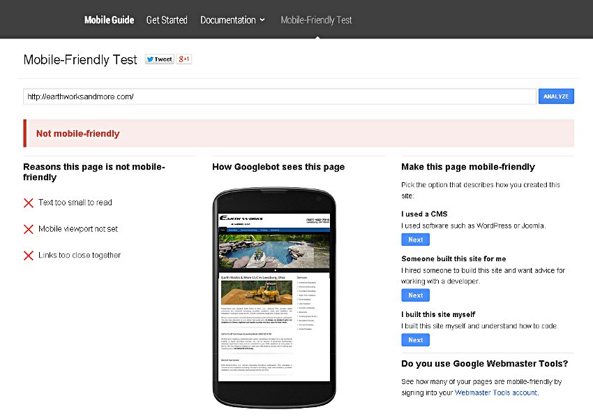
Not sure whether your site is mobile-friendly or not? Use Google’s mobile-friendly test page to find out. If it fails, you’ll see this:
6 Steps to Mobile-Friendliness
1. Optimize for Mobile Local Search
Twenty percent of Google’s four billion searches a day are local in intent. And on mobile, it’s closer to 50 percent. If you are a local business, you must take steps to be found in a local search. Here’s how to get started.
Get Listed in Google, Yahoo, and Bing’s “Local” Section
Each search engine has a special section reserved for local businesses. (Only companies with a physical address within the city of the search query appear in this section.) Claiming each listing increases your likelihood of showing up here.
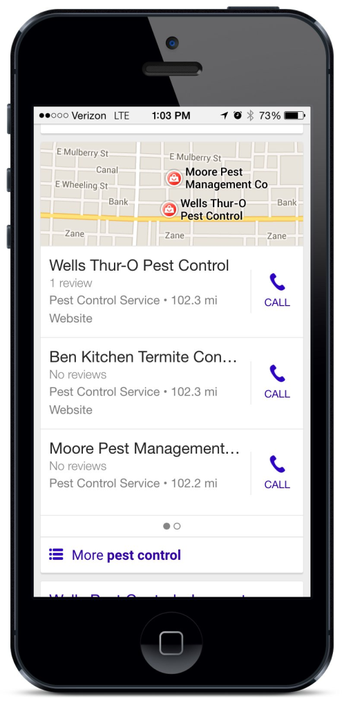
Local listings appear above the organic results. On a mobile device, this means your local listing has the potential to be the first thing a user sees once they scroll past any paid listings.
Other Local Listings
Roughly half of mobile local search occurs in apps. While Google Maps is the most popular, Yahoo, Mapquest, Bing, Yellowbook, Yelp, Superpages and Apple Maps have over half of the app market share. So it’s important to get listed on these directories as well.
In fact, there are over 250 local search directories, Internet Yellow Pages, and review sites your local business ought to be listed on. These directories get their listings from four major data suppliers: Infogroup, Localeze, Acxiom, and Factual. The first three allow you to add your business information to their database—for a fee, of course. Once you do, your business information will eventually be included in each directory they supply data to.
For more information on claimed listings and list submission see [Local SEO: The Basics] (https://www.sitepoint.com/basics-local-seo/).
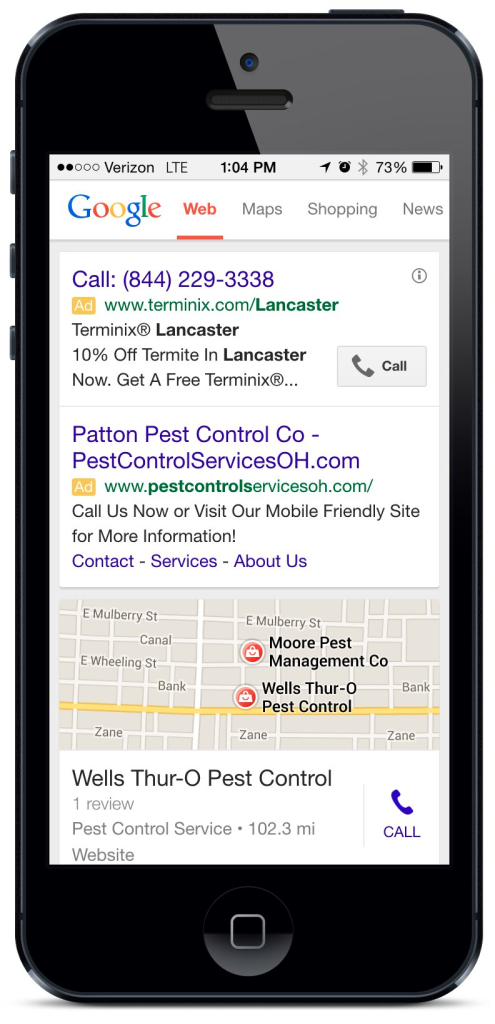
Advertise on Google
Depending on your budget and the competitiveness of your market, paid advertising can be an effective way to generate leads from mobile searchers. On a mobile device, paid ads appear above the local section:
2. Choose a Mobile Solution
The three methods to create mobile sites are: responsive design, parallel mobile, and dynamic serving.
Responsive Design is a flexible layout that automatically “responds” (i.e., resizes) to the screen size of device being used.
Parallel Mobile is a duplicate mobile site on a separate URL. Rather than www.example.com, mobile visitors are redirected to m.example.com.
Dynamic Serving serves a different page, depending on the device, but on the same URL.
From a development perspective, each has its issues. For more information, the SEO PowerSuite guide to mobile-friendly sites has a detailed breakdown of the pros and cons of each.
Mobile Options for WordPress Sites
If you have an existing WordPress site hosted on your own domain, use Google’s mobile-friendly test page to see if it’s mobile-friendly. If it isn’t, you have two options:
Many newer themes are responsive. Consider switching to one that is.
If changing themes isn’t an option, there are plenty of free and paid plugins that will do the trick.
3. Make it Easy for Mobile Searchers to Call or Find You
User activity on your mobile site is another ranking factor. So make sure visitors have easy access to a “click to call” button and a map.

4. Make Sure Your Page Isn’t Slow
Reducing the number of HTTP requests and optimizing your images will make your website load faster. Google’s PageSpeed Insight will tell you exactly what problems your site has and how to fix them. I’ve listed the common ones below.
Reducing HTTP Requests
Each image, CSS, and JavaScript file is another HTTP request to the server. Here are some techniques to reduce their number.
Be sure to have just one external CSS file and one external script file.
Place internal JavaScript at the bottom of your html, before the closing body tag.
Minify CSS and JavaScript.
CSS Sprites can combine multiple images requests into just one.
Use Date URIs.
Avoid bad HTTP requests by eliminating broken links.
Enable browser caching.
Optimizing Images
Optimizing web images for faster downloads is Web Design 101. Be sure you’re following best practices.
Use a jQuery plugin or responsive image solution to swap out larger images with smaller ones.
5. Avoid Common Mistakes
Using Pop-Ups
Pop-ups don’t work on mobile devices. They fill the whole screen and finding the tiny ‘x’ to close them is next to impossible.
Blocking CSS, JavaScript or Images
Google’s indexing systems used to resemble old text-only browsers, so search engines did not need to crawl or index these files. To prevent unnecessary crawls, webmasters would often block these files in robots.txt. And content management platforms (such as Joomla pre-July 2014) often blocked them by default.
However, in November 2014, Google officially announced that doing so interferes with how your site is indexed and can hurt your rankings.
Faulty Redirects
If you have a separate parallel mobile site, mobile users must be redirected to the corresponding mobile version of each page.
If your site redirects mobile users to the mobile site’s homepage (regardless of which URL they requested), this is a problem—both for the Googlebot and your users. Google will demote your mobile page if it has faulty redirects.

6. Use These Tools to Track and Improve Mobile Ranking
Track Your Mobile Ranking
SEO PowerSuite’s Rank Tracker can track your site’s organic rankings in mobile search engines.
Find Out How Google’s Update will Affect You
Concerned you’ll losing ranking with Google’s upcoming mobile-friendly update? Check out Search Engine Land’s guide to estimate your potential traffic lost.
Target Mobile-Specific Keywords
Are you missing out on keywords that your audience uses on a mobile device that they don’t use on a desktop search? The Google Keyword Planner will help you with mobile keyword research.
Conclusion
I started this article with one quote, and I’ll leave you with another:
These findings and survey results … should serve if nothing else as a stern kick in the pants for marketers who’ve been dragging their heels or underinvested in mobile to date. Now’s the time to get very serious — or risk losing perhaps half your audience. – Greg Sterling, Marketing Land
Are you prepared for Google’s so-called “mobilepocalypse”? Has mobile changed your SEO strategy? Tell us what you think in the comments below.
Frequently Asked Questions on Mobile SEO
What is the importance of mobile SEO in today’s digital landscape?
Mobile SEO is crucial in today’s digital landscape due to the increasing number of users accessing the internet through their mobile devices. It ensures that your website is optimized for these users, providing a seamless and user-friendly experience. This can significantly impact your website’s visibility in search engine results, as Google and other search engines prioritize mobile-friendly websites. Therefore, neglecting mobile SEO can result in lower search rankings, less organic traffic, and ultimately, fewer conversions.
How does mobile SEO differ from desktop SEO?
While both mobile and desktop SEO aim to optimize websites for search engines, they differ in several ways. Mobile SEO focuses on improving the website experience for mobile users. This includes ensuring that the website loads quickly, is easy to navigate on a smaller screen, and doesn’t use software that isn’t common on mobile devices. On the other hand, desktop SEO focuses on optimizing websites for larger screens and might not take into account the unique challenges of mobile browsing.
What are the key elements of a mobile-friendly website?
A mobile-friendly website should have a responsive design that adjusts to different screen sizes, fast loading times, easy-to-read text, and easy-to-click links. It should also avoid using software that isn’t common on mobile devices, like Flash. The website should be designed with the mobile user in mind, ensuring that they can easily navigate and interact with the website.
How can I test if my website is mobile-friendly?
There are several tools available to test if your website is mobile-friendly. Google’s Mobile-Friendly Test is one such tool. Simply enter your website’s URL, and the tool will analyze your website and provide a report on its mobile-friendliness. It will also provide recommendations on how to improve your website’s mobile experience.
How does page speed affect mobile SEO?
Page speed is a critical factor in mobile SEO. Mobile users often have slower internet connections than desktop users, so it’s essential that your website loads quickly. Slow-loading websites can frustrate users and lead to higher bounce rates. Additionally, Google considers page speed as a ranking factor, so improving your website’s loading times can also improve your search rankings.
What is mobile-first indexing and how does it impact SEO?
Mobile-first indexing is a practice by Google where it primarily uses the mobile version of a website for indexing and ranking. This means that if your website isn’t optimized for mobile, it could negatively impact your search rankings. Therefore, it’s crucial to ensure that your website provides a seamless and user-friendly experience on mobile devices.
How can I optimize my website for local mobile searches?
To optimize your website for local mobile searches, ensure that your website has a responsive design, fast loading times, and easy-to-read text. Additionally, include your business’s name, address, and phone number on your website, and use local keywords in your content. You can also use Google My Business to increase your visibility in local search results.
What are the common mistakes to avoid in mobile SEO?
Common mistakes in mobile SEO include not having a mobile-friendly website, slow loading times, difficult navigation, and using software not common on mobile devices. Additionally, not optimizing for local search and not considering the unique challenges of mobile browsing can also negatively impact your mobile SEO.
How does responsive design contribute to mobile SEO?
Responsive design is a web design approach that makes your website look and function well on different devices, including mobile. It adjusts the layout, images, and other elements of your website to fit the screen size of the device. This provides a better user experience, which can lead to higher engagement and lower bounce rates. Additionally, Google recommends responsive design as a key strategy for mobile SEO.
How can I keep up with the latest trends in mobile SEO?
Keeping up with the latest trends in mobile SEO can be challenging due to the rapidly changing digital landscape. However, regularly reading SEO blogs, attending webinars and conferences, and following industry experts on social media can help you stay updated. Additionally, using SEO tools and regularly analyzing your website’s performance can also provide insights into areas of improvement.
 John Tabita
Former owner and partner of web firm Jenesis Technologies, John is currently Director of Digital Strategy at Haines Local Search, a company providing local search marketing solutions to SMBs, including print and Internet Yellow Pages, web design, and local SEO. When not working or spending time with his family, John offers great sales and marketing advice on his blog, Small Business Marketing Sucks. When not working or spending time with his family, John offers great sales and marketing advice on his blog, Small Business Marketing Sucks.


