When the Office of Management and Budget (OMB) released President's Budget for Fiscal Year 2016 in machine readable form, couple of weeks back, it was first of its kind that we had seen. We have seen private organizations and non-profits disclosing their financial information before (
Buffer,
Baremetrics etc…). The
UsaSpending.gov was another example we came across, for which we published reports showing the data available there, which we removed later due to concerns related to the quality of data available. So this time we were very excited to see OMB putting all that information in to public, encouraging further analysis and discussion. Definitely a big step in promoting transparency in governance.
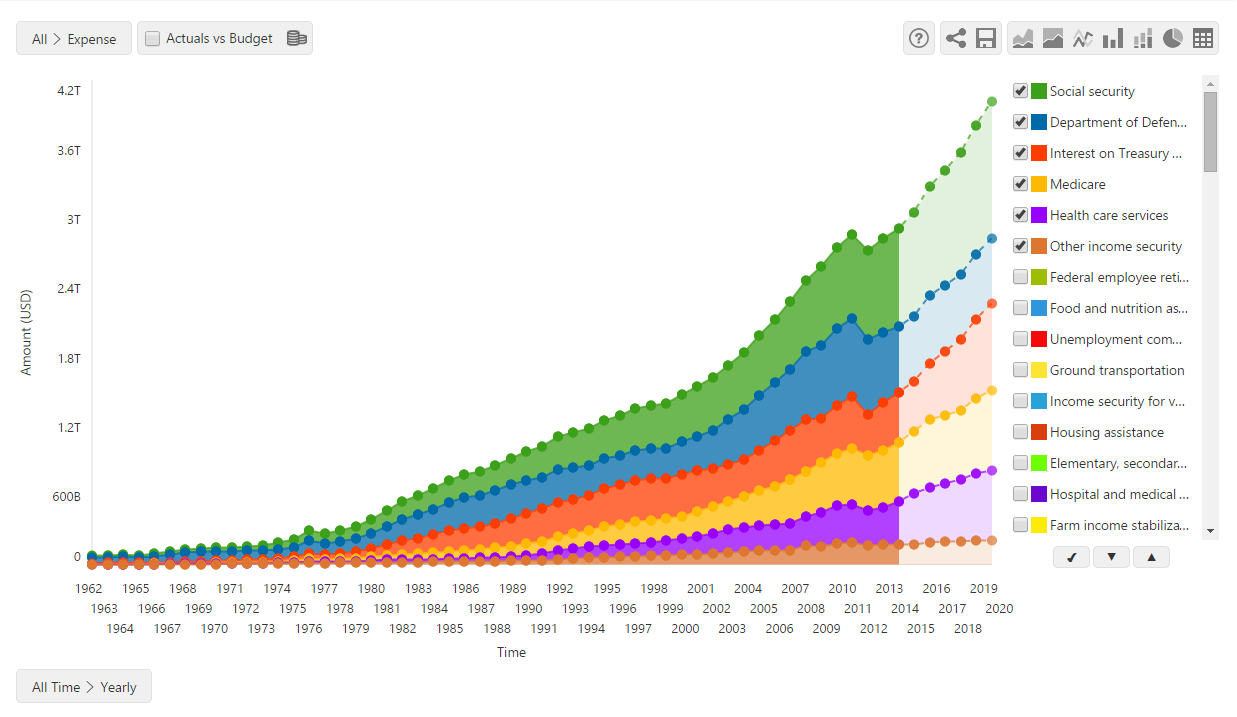
The data published by OMB is at account level detail. Here at OpenReporting, our tool can visualize data from a top level summary - like income, expense - and drill down all the way down to data at transaction level. So we hesitated a bit at first on whether or not to publish this on our portal but after seeing the excitement in the transparency community, we decided to go ahead and publish the reports at account level detail. You can find the resulting report here.
The data consists of actual revenues and spending (we call them income and expense in our reports) from financial year 1962 to 2014 and budget amounts for 2015 to 2020. In coming years, we will be able to show comparison of actual against budget as data is made available. If you are aware of any machine readable dataset for past budget amounts, please let us know and we will upload it here so that you can compare them with actuals for past years.
The amounts shown in the report are in nominal dollars and hence the change in budget over year may appear dramatic at first sight. It may be a good idea to keep the inflation rate in mind when analyzing the report. We had thought about publishing the data in current day dollars but later dropped this plan to keep consistency with the published data.
The main source of the data are the files available in White House’s GitHub repository. We have also used the various excel reports published, to cross check the figures in report. The interpretation of the data was done with the help of user guides below. You may want check them if you have any questions.
When it comes to transparency, our focus is to provide the most simplest and complete visualization for the citizens so that they can easily get a picture of how their government is spending resources. Please do let us know your thoughts on how we can improve this further and help us spread the word on social media.